Lecture 4: Data Visualization
DSCI 100
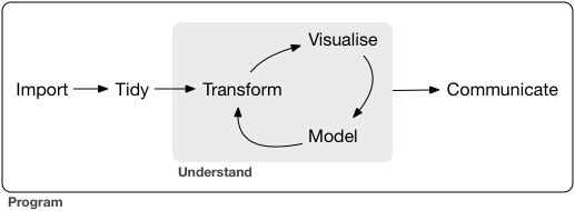
Designing a Visualization
Ask a question, then answer it
Designing a Visualization
Visualizations alone help us answer two types of questions:
- descriptive: What are the largest 7 landmasses on Earth?
- exploratory: Is there a relationship between penguin body mass and bill length?
inferentialpredictivecausalmechanistic
(we need more tools + visualizations to answer the others)
Creating Visualizations in R with ggplot
ggplot is loaded in with the tidyverse package in R, or can be loaded on its own! We need a number of functions from various packages from the tidyverse (including dplyr, so we’ll load in tidyverse:
Scatter Plots
Scatterplots are used to visualize the relationship between two quantitative variables
- Example: Is there a relationship between horsepower and fuel economy of an engine? Does the number of cylinders affect that relationship?
Line Plots
Line plots are used to visualize trends with respect to an independent quantity
- Example: How has atmospheric carbon dioxide changed over the last 40 years?
Not coding in these slides? You can find co2_df as a csv file here
Bar Plots
Barplots are used to visualize the comparison of amounts
- Example: Which are the largest 12 island landmasses on Earth? Are they all continents or are there some other islands with large landmasses as well?
Not coding in these slides? You can find islands_df as a csv file here
Histograms
Histograms are used to visualize the distribution of a single quantitative variable
- Example: Was there a difference in life expectancy across different continents in 2016?
Not coding in these slides? You can find gapminder_2016 data as a csv file here
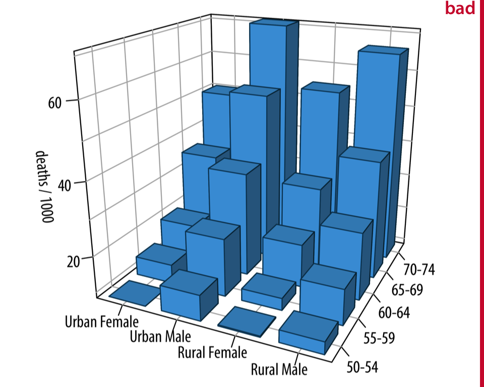
Rules of Thumb for Visualizations
1) No tables / pie charts
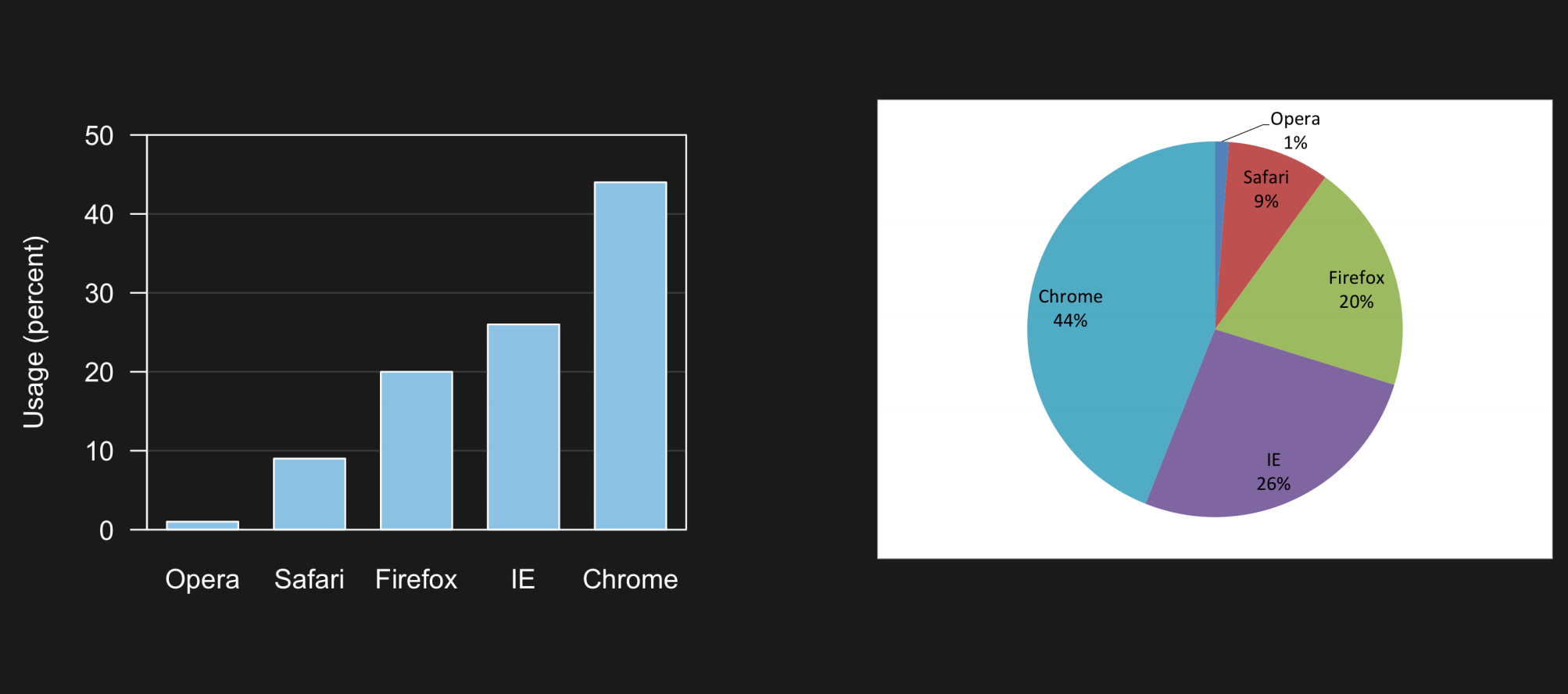
Which one is easier to interpret?
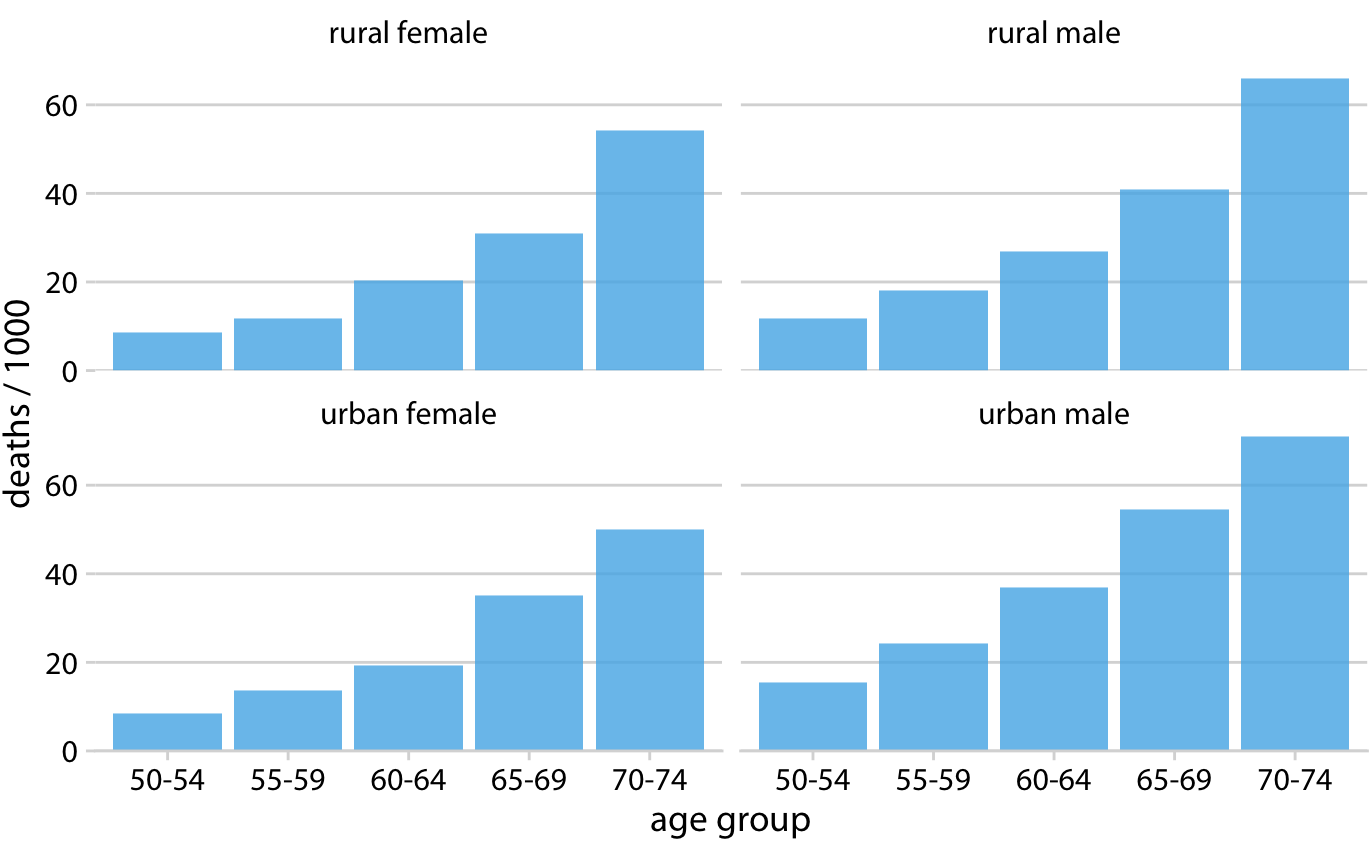
Rules of Thumb for Visualizations
2) No 3D visualizations
Rules of Thumb for Visualizations
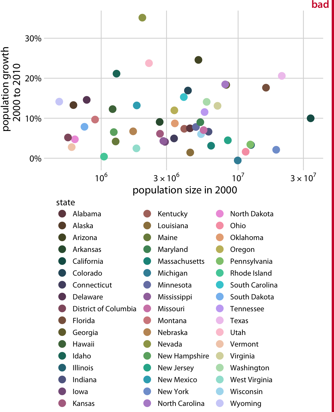
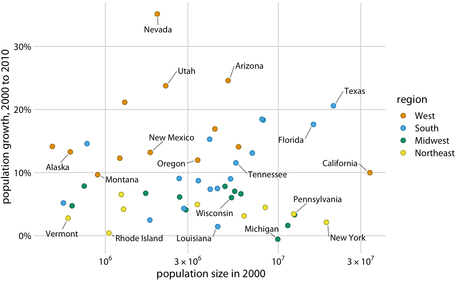
3) Use simple, colourblind-friendly colour palettes
Rules of Thumb for Visualizations
4) Include labels and legends, make them legible
Remember: a great visualization tells its own story without needing you to be there explaining things
Rules of Thumb for Visualizations
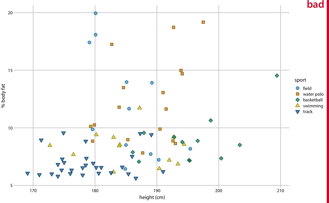
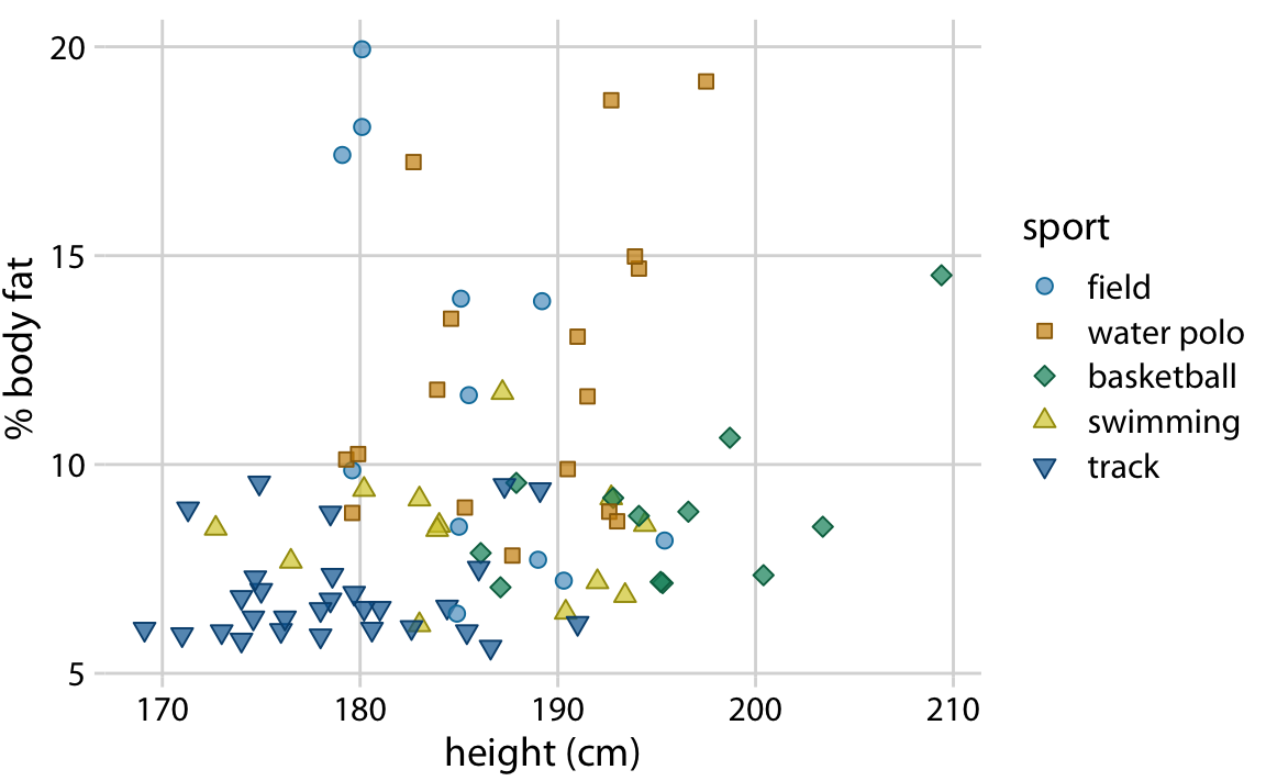
5) Avoid overplotting
Generally, need to use an alternative geometric object
Add alpha = 0.2 to geom_point()
- transparency setting must be between [0,1]