Exploratory Data Analysis
DSCI 200
Katie Burak, Gabriela V. Cohen Freue
Last modified – 05 January 2026
\[
\DeclareMathOperator*{\argmin}{argmin}
\DeclareMathOperator*{\argmax}{argmax}
\DeclareMathOperator*{\minimize}{minimize}
\DeclareMathOperator*{\maximize}{maximize}
\DeclareMathOperator*{\find}{find}
\DeclareMathOperator{\st}{subject\,\,to}
\newcommand{\E}{E}
\newcommand{\Expect}[1]{\E\left[ #1 \right]}
\newcommand{\Var}[1]{\mathrm{Var}\left[ #1 \right]}
\newcommand{\Cov}[2]{\mathrm{Cov}\left[#1,\ #2\right]}
\newcommand{\given}{\ \vert\ }
\newcommand{\X}{\mathbf{X}}
\newcommand{\x}{\mathbf{x}}
\newcommand{\y}{\mathbf{y}}
\newcommand{\P}{\mathcal{P}}
\newcommand{\R}{\mathbb{R}}
\newcommand{\norm}[1]{\left\lVert #1 \right\rVert}
\newcommand{\snorm}[1]{\lVert #1 \rVert}
\newcommand{\tr}[1]{\mbox{tr}(#1)}
\newcommand{\brt}{\widehat{\beta}^R_{s}}
\newcommand{\brl}{\widehat{\beta}^R_{\lambda}}
\newcommand{\bls}{\widehat{\beta}_{ols}}
\newcommand{\blt}{\widehat{\beta}^L_{s}}
\newcommand{\bll}{\widehat{\beta}^L_{\lambda}}
\newcommand{\U}{\mathbf{U}}
\newcommand{\D}{\mathbf{D}}
\newcommand{\V}{\mathbf{V}}
\]
Attribution
This material is adapted from the following sources:
Learning Objectives
By the end of this lesson, you will be able to:
Investigate relationships between variables using correlation
Examine the limitations of Pearson’s correlation and recognize scenarios where it can be misleading, including Simpson’s Paradox
Discuss how choices made during EDA can impact the entire data analysis pipeline
Recognize the role of data splitting in preventing bias and ensuring generalizability
Review
Last class we saw the usage of scatterplots as a useful way to visualize the relationship between two numerical variables.
However, it would be nice to be able to quantify this relationship with some measure of covariation…
What is Correlation?
Correlation measures the strength and direction of a relationship between variables
For example, correlation analysis could help us explore the following questions:
Is there a relationship between social media usage and mental health scores among teenagers?
Do housing prices correlate with interest rates in different regions?
Does the frequency of push notifications correlate with user engagement in a mobile app?
Pearson Correlation
Pearson correlation is maybe the most common, and it measures the strength of a linear relationship between two numeric variables.
Values range from -1 to 1:
1: perfect positive linear relationship
-1: perfect negative linear relationship
0: no linear relationship
Pearson Correlation
For two variables \(X\) and \(Y\) , the estimated pearson correlation coefficient, \(r\) , is given by the following formula:
\[ r = \frac{\sum_{i=1}^n(x_i-\bar{x})(y_i-\bar{y})}{\sqrt{\sum_{i=1}^n(x_i-\bar{x})^2(y_i-\bar{y})^2}},\]
where
\(n\) is the sample size\(x_i\) and \(y_i\) are the \(i^{th}\) observations of \(X\) and \(Y\) , respectively\(\bar{x}\) and \(\bar{y}\) are the estimated sample means of \(X\) and \(Y\) , respectively
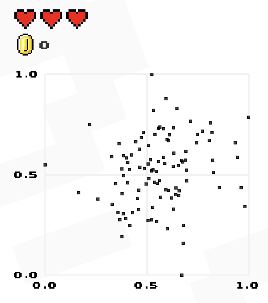
Guess the Correlation
Take a minute and play a few rounds of “Guess the Correlation ” to get a better idea about the strength of different correlations.
Load packages
library (tidyverse)library (tidymodels)library (corrr)
Computing correlations in R
Luckily, there are functions in R that compute correlations for us!
While there is a default function cor() in base R, the correlate() function in the corrr package integrates more smoothly with our tidy workflows.
Let’s work with airquality data from the datasets pacakge.
  Ozone Solar.R Wind Temp Month Day
1    41     190  7.4   67     5   1
2    36     118  8.0   72     5   2
3    12     149 12.6   74     5   3
4    18     313 11.5   62     5   4
5    NA      NA 14.3   56     5   5
6    28      NA 14.9   66     5   6
Let’s investigate the relationship between mean ozone (ppb) from 1-3pm and maximum daily temperature in degrees Fahrenheit.
We can see a moderately strong positive relationship.
ggplot (airquality, aes (x = Ozone, y = Temp)) + geom_point (alpha = 0.6 , color = "steelblue" ) + theme_minimal ()
Compute correlation
|> select (Ozone, Temp) |> correlate ()
# A tibble: 2 × 3
  term   Ozone   Temp
  <chr>  <dbl>  <dbl>
1 Ozone NA      0.698
2 Temp   0.698 NA
Note that the diagonal values are printed as NA, but the correlation between a variable and itself is simply 1.
To just extract the single correlation value:
|> select (Ozone, Temp) |> correlate () |> filter (term == "Ozone" ) |> pull (Temp)
Correlation matrices
Sometimes, we want to calculate the correlations among multiple numeric variables at once.
In such cases, a correlation matrix is useful for exploring the relationships between several variables simultaneously.
|> select (Ozone,Solar.R,Temp,Wind) |> correlate ()
# A tibble: 4 × 5
  term     Ozone Solar.R   Temp    Wind
  <chr>    <dbl>   <dbl>  <dbl>   <dbl>
1 Ozone   NA      0.348   0.698 -0.602
2 Solar.R  0.348 NA       0.276 -0.0568
3 Temp     0.698  0.276  NA     -0.458
4 Wind    -0.602 -0.0568 -0.458 NA
Visualizing Correlation
<- airquality |> select (Ozone,Solar.R,Temp,Wind) |> correlate () |> rearrange () |> shave () rplot (correlations)
Limitations of Pearson Correlation
Pearson \(r\) measures linear relationships only.
It can be 0 even when a strong nonlinear relationship exists!
Limitations of Pearson Correlation
Assumes both variables are continuous and normally distributed
Pearson correlation requires numeric variables; it’s not appropriate to compute it directly between categorical and numerical variables or between two categorical variables
Alternatives exist :
Spearman’s rho (for ordinal or ranked data)
Kendall’s tau (for ordinal or ranked data)
Phi coefficient (for two binary variables)
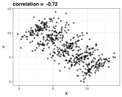
Scenario
What do you think the correlation is between \(X\) and \(Y\) ?
Compute correlation
\(r=0.187\) (weak, positive correlation)
|> select (x, y) |> correlate ()
# A tibble: 2 × 3
  term       x      y
  <chr>  <dbl>  <dbl>
1 x     NA      0.187
2 y      0.187 NA
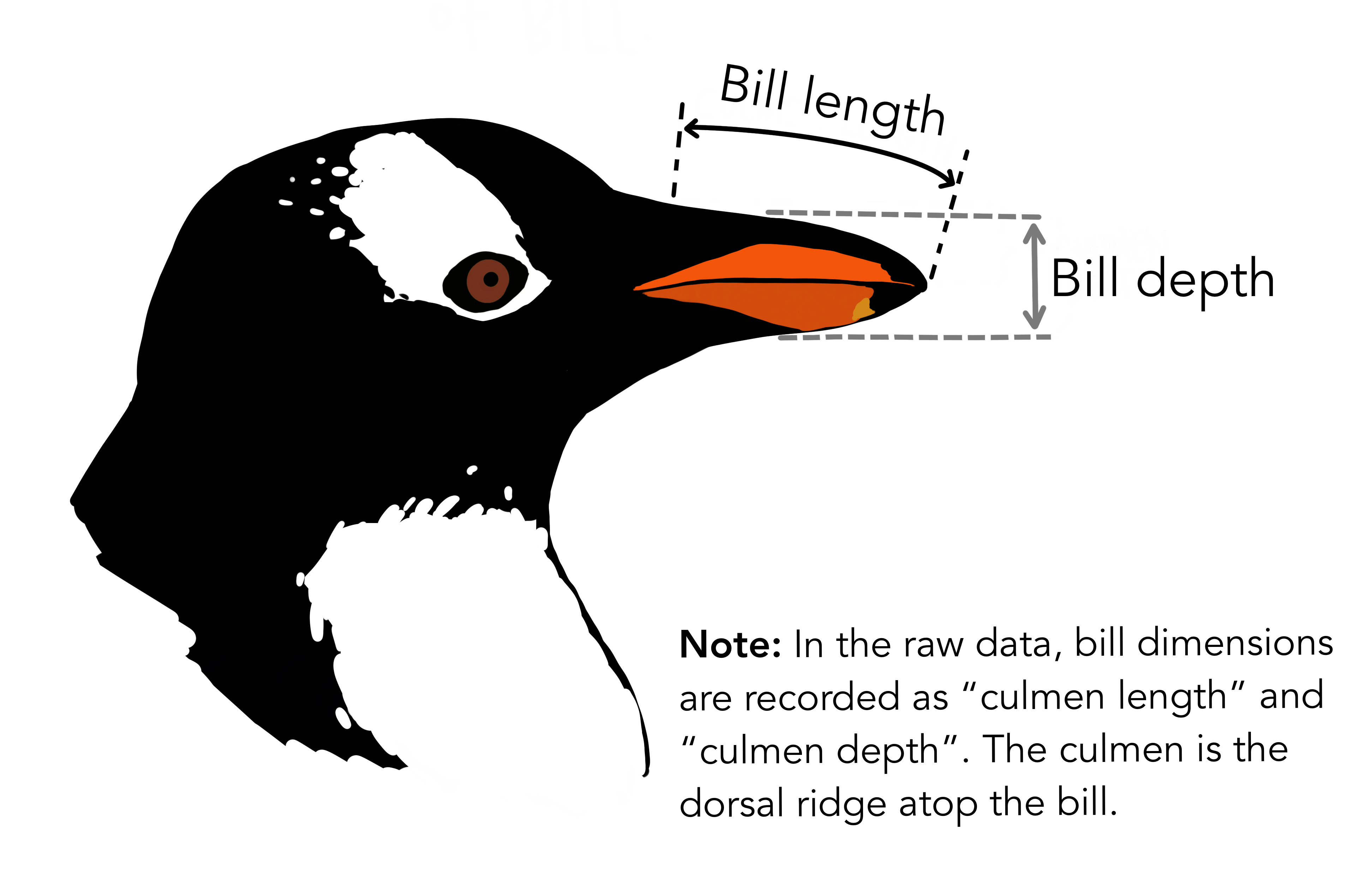
Bill Length vs. Bill Depth
Using the palmerpenguins dataset:
Make a scatterplot of bill length vs. bill depth
Compute the correlation between the two variables
Then, color the points by species and observe what changes
iClicker Question
What best describes the relationship between bill length and bill depth?
A. Negative correlation overall; still negative within each species
B. Positive correlation overall; stronger within each species
C. Negative correlation overall; positive within each species
D. Minimal correlation overall or within groups
Correlation ≠ Causation
Just because two variables are correlated, does not mean one causes the other!
Correlation can also be coincidental or arise from a confounding variable (more to come later in the course).
EDA and the Data Pipeline
EDA choices are not just cosmetic; they can fundamentally alter your analysis!
What we filter, transform, and create in EDA directly shapes:
What models we build
How well they perform
How we interpret results
In-class Exercise
Given the EDA pipeline below, discuss with a neighbour:
Which steps might improve modeling?
Which could bias results or reduce generalizability?
What would you ask your team before proceeding?
# EDA pipeline in R <- raw_data |> filter (income > 0 ) |> mutate (log_income = log (income),seniority = years_exp > 5 |> select (- postalcode)
Diamonds Example
You’re working with diamond pricing data (diamonds data from ggplot2 pacakge). 💎
Goal: Predict the price of a diamond (price) using its carat weight (carat).
# A tibble: 6 × 10
  carat cut       color clarity depth table price     x     y     z
  <dbl> <ord>     <ord> <ord>   <dbl> <dbl> <int> <dbl> <dbl> <dbl>
1  0.23 Ideal     E     SI2      61.5    55   326  3.95  3.98  2.43
2  0.21 Premium   E     SI1      59.8    61   326  3.89  3.84  2.31
3  0.23 Good      E     VS1      56.9    65   327  4.05  4.07  2.31
4  0.29 Premium   I     VS2      62.4    58   334  4.2   4.23  2.63
5  0.31 Good      J     SI2      63.3    58   335  4.34  4.35  2.75
6  0.24 Very Good J     VVS2     62.8    57   336  3.94  3.96  2.48
Before diving into modeling, a colleague says:
“We usually talk about diamond size in terms of groups XS-XL when discussing pricing with customers. Should we just model with those?”
You now face a choice:
Model carat as a continuous variable
Or bin carat into categories
What do you think the tradeoffs are?
Let’s compare:
Model A: Continuous carat
Model B: Binned carat_group
<- diamonds |> select (price, carat) |> mutate (carat_group = cut (breaks = c (0 , 0.5 , 1 , 1.5 , 2 , 5 ),labels = c ("extra small" , "small" , "medium" , "large" , "extra large" ),right = FALSE |> filter (! is.na (carat_group))
|> ggplot (aes (x = carat_group, y = price)) + geom_boxplot (fill= "cornflowerblue" ) + labs (title = "Diamond Price by Carat Group" ) + theme_minimal ()
library (rsample)library (tidymodels)set.seed (200 )<- initial_split (df, prop = 0.75 , strata = price)<- training (diamond_split)<- testing (diamond_split)# Model spec <- linear_reg () |> set_engine ("lm" ) |> set_mode ("regression" )# Recipe for Model A (carat continuous) <- recipe (price ~ carat, data = diamond_train)# Recipe for Model B (carat binned categories) <- recipe (price ~ carat_group, data = diamond_train) # Workflow for Model A <- workflow () |> add_recipe (lm_recipe_A) |> add_model (lm_spec) |> fit (data = diamond_train)# Workflow for Model B <- workflow () |> add_recipe (lm_recipe_B) |> add_model (lm_spec) |> fit (data = diamond_train)
Fitted models
# A tibble: 2 × 5
  term        estimate std.error statistic p.value
  <chr>          <dbl>     <dbl>     <dbl>   <dbl>
1 (Intercept)   -2250.      15.0     -150.       0
2 carat          7745.      16.2      479.       0
# A tibble: 5 × 5
  term                   estimate std.error statistic p.value
  <chr>                     <dbl>     <dbl>     <dbl>   <dbl>
1 (Intercept)                792.      13.5      58.5       0
2 carat_groupsmall          1705.      19.3      88.3       0
3 carat_groupmedium         5345.      20.9     256.        0
4 carat_grouplarge         10081.      31.3     322.        0
5 carat_groupextra large   14012.      41.1     341.        0
RMSPE
# Model A (carat continuous) <- lm_fit_A |> predict (diamond_test) |> bind_cols (diamond_test) |> rmse (truth = price, estimate = .pred) |> mutate (model = "Carat continuous" )# Model B (carat binned) <- lm_fit_B |> predict (diamond_test) |> bind_cols (diamond_test) |> rmse (truth = price, estimate = .pred) |> mutate (model = "Carat binned" )<- bind_rows (rmse_A, rmse_B) |> select (model, .metric, .estimator, .estimate)print (rmse_results)
# A tibble: 2 × 4
  model            .metric .estimator .estimate
  <chr>            <chr>   <chr>          <dbl>
1 Carat continuous rmse    standard       1561.
2 Carat binned     rmse    standard       1572.
Discussion: Think, Pair, Share
Continuous or binned: which strategy would you choose and why?
What do we assume when we bin carat?
Could this influence pricing strategies?
iClicker Question
In your opinion, when is it most appropriate to split your data into training and test sets?
A. Before doing any EDA
B. After EDA
C. Right before modeling
D. I’m not sure
Why Split Before EDA?
It is often recommended to split your data before performing EDA.
Analyzing the full dataset can leak information from the test set into the model or analysis.
If we tailor preprocessing, feature engineering or generate hypotheses using the whole dataset:
It introduces data snooping bias.
The model may overfit to patterns it shouldn’t have access to.
Remember your test set should simulate unseen data!
It’s Not Always One-Size-Fits-All!
The decision to split before or after EDA depends on your goals and the context.
Sometimes it makes sense to perform minimal checks on the full dataset to:
Detect inconsistent data types
Check for class imbalance
Identify missing values or obvious data issues
If your goal is descriptive analysis (not predictive modeling or inference), a train/test split may not be necessary.
The key is to think critically about your objectives and the potential for data leakage.
Key Takeaways
Correlation quantifies the strength and direction of relationships between variables
Pearson’s correlation captures only linear relationships and it may miss or misrepresent more complex patterns
Choices during EDA (e.g., filtering, transforming, and feature selection) shape your modeling outcomes
Splitting data before EDA helps prevent leakage and supports valid inference and model evaluation