 Data Science
Chapter 8 Regression II: linear regression
8.1 Overview
Up to this point, we have solved all of our predictive problems—both classification
and regression—using K-nearest neighbors (K-NN)-based approaches. In the context of regression,
there is another commonly used method known as linear regression. This chapter provides an introduction
to the basic concept of linear regression, shows how to use tidymodels to perform linear regression in R,
and characterizes its strengths and weaknesses compared to K-NN regression. The focus is, as usual,
on the case where there is a single predictor and single response variable of interest; but the chapter
concludes with an example using multivariable linear regression when there is more than one
predictor.
8.2 Chapter learning objectives
By the end of the chapter, readers will be able to do the following:
- Use R to fit simple and multivariable linear regression models on training data.
- Evaluate the linear regression model on test data.
- Compare and contrast predictions obtained from K-nearest neighbors regression to those obtained using linear regression from the same data set.
- Describe how linear regression is affected by outliers and multicollinearity.
8.3 Simple linear regression
At the end of the previous chapter, we noted some limitations of K-NN regression. While the method is simple and easy to understand, K-NN regression does not predict well beyond the range of the predictors in the training data, and the method gets significantly slower as the training data set grows. Fortunately, there is an alternative to K-NN regression—linear regression—that addresses both of these limitations. Linear regression is also very commonly used in practice because it provides an interpretable mathematical equation that describes the relationship between the predictor and response variables. In this first part of the chapter, we will focus on simple linear regression, which involves only one predictor variable and one response variable; later on, we will consider multivariable linear regression, which involves multiple predictor variables. Like K-NN regression, simple linear regression involves predicting a numerical response variable (like race time, house price, or height); but how it makes those predictions for a new observation is quite different from K-NN regression. Instead of looking at the K nearest neighbors and averaging over their values for a prediction, in simple linear regression, we create a straight line of best fit through the training data and then “look up” the prediction using the line.
Note: Although we did not cover it in earlier chapters, there is another popular method for classification called logistic regression (it is used for classification even though the name, somewhat confusingly, has the word “regression” in it). In logistic regression—similar to linear regression—you “fit” the model to the training data and then “look up” the prediction for each new observation. Logistic regression and K-NN classification have an advantage/disadvantage comparison similar to that of linear regression and K-NN regression. It is useful to have a good understanding of linear regression before learning about logistic regression. After reading this chapter, see the “Additional Resources” section at the end of the classification chapters to learn more about logistic regression.
Let’s return to the Sacramento housing data from Chapter 7 to learn how to apply linear regression and compare it to K-NN regression. For now, we will consider a smaller version of the housing data to help make our visualizations clear. Recall our predictive question: can we use the size of a house in the Sacramento, CA area to predict its sale price? In particular, recall that we have come across a new 2,000 square-foot house we are interested in purchasing with an advertised list price of $350,000. Should we offer the list price, or is that over/undervalued? To answer this question using simple linear regression, we use the data we have to draw the straight line of best fit through our existing data points. The small subset of data as well as the line of best fit are shown in Figure 8.1.
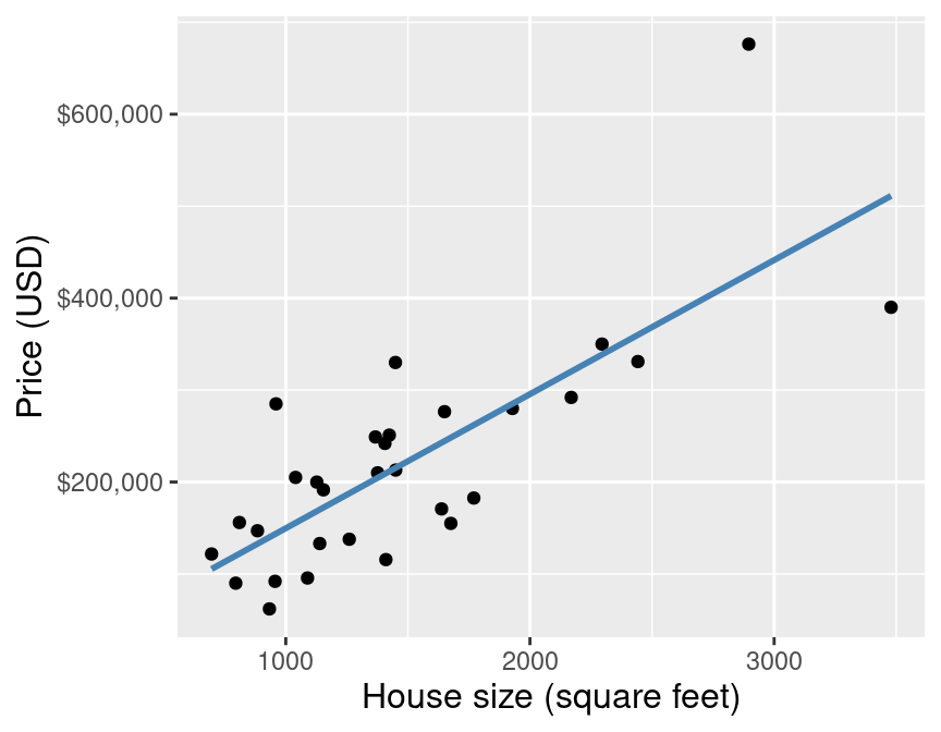
Figure 8.1: Scatter plot of sale price versus size with line of best fit for subset of the Sacramento housing data.
The equation for the straight line is:
\[\text{house sale price} = \beta_0 + \beta_1 \cdot (\text{house size}),\] where
- \(\beta_0\) is the vertical intercept of the line (the price when house size is 0)
- \(\beta_1\) is the slope of the line (how quickly the price increases as you increase house size)
Therefore using the data to find the line of best fit is equivalent to finding coefficients \(\beta_0\) and \(\beta_1\) that parametrize (correspond to) the line of best fit. Now of course, in this particular problem, the idea of a 0 square-foot house is a bit silly; but you can think of \(\beta_0\) here as the “base price,” and \(\beta_1\) as the increase in price for each square foot of space. Let’s push this thought even further: what would happen in the equation for the line if you tried to evaluate the price of a house with size 6 million square feet? Or what about negative 2,000 square feet? As it turns out, nothing in the formula breaks; linear regression will happily make predictions for nonsensical predictor values if you ask it to. But even though you can make these wild predictions, you shouldn’t. You should only make predictions roughly within the range of your original data, and perhaps a bit beyond it only if it makes sense. For example, the data in Figure 8.1 only reaches around 800 square feet on the low end, but it would probably be reasonable to use the linear regression model to make a prediction at 600 square feet, say.
Back to the example! Once we have the coefficients \(\beta_0\) and \(\beta_1\), we can use the equation above to evaluate the predicted sale price given the value we have for the predictor variable—here 2,000 square feet. Figure 8.2 demonstrates this process.
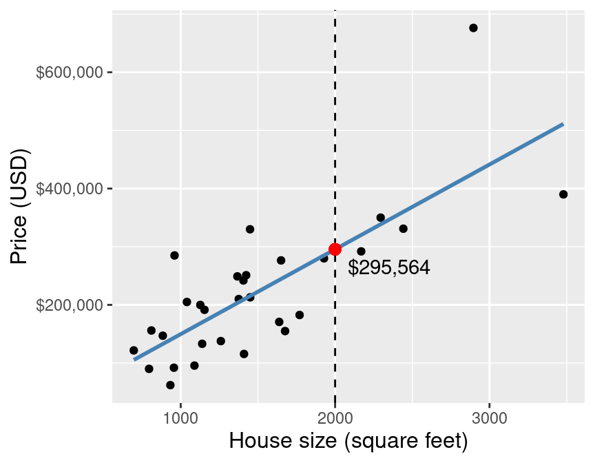
Figure 8.2: Scatter plot of sale price versus size with line of best fit and a red dot at the predicted sale price for a 2,000 square-foot home.
By using simple linear regression on this small data set to predict the sale price for a 2,000 square-foot house, we get a predicted value of $295,564. But wait a minute… how exactly does simple linear regression choose the line of best fit? Many different lines could be drawn through the data points. Some plausible examples are shown in Figure 8.3.
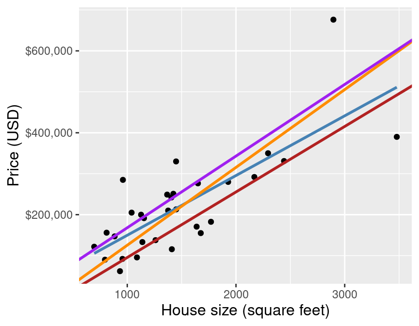
Figure 8.3: Scatter plot of sale price versus size with many possible lines that could be drawn through the data points.
Simple linear regression chooses the straight line of best fit by choosing the line that minimizes the average squared vertical distance between itself and each of the observed data points in the training data (equivalent to minimizing the RMSE). Figure 8.4 illustrates these vertical distances as red lines. Finally, to assess the predictive accuracy of a simple linear regression model, we use RMSPE—the same measure of predictive performance we used with K-NN regression.
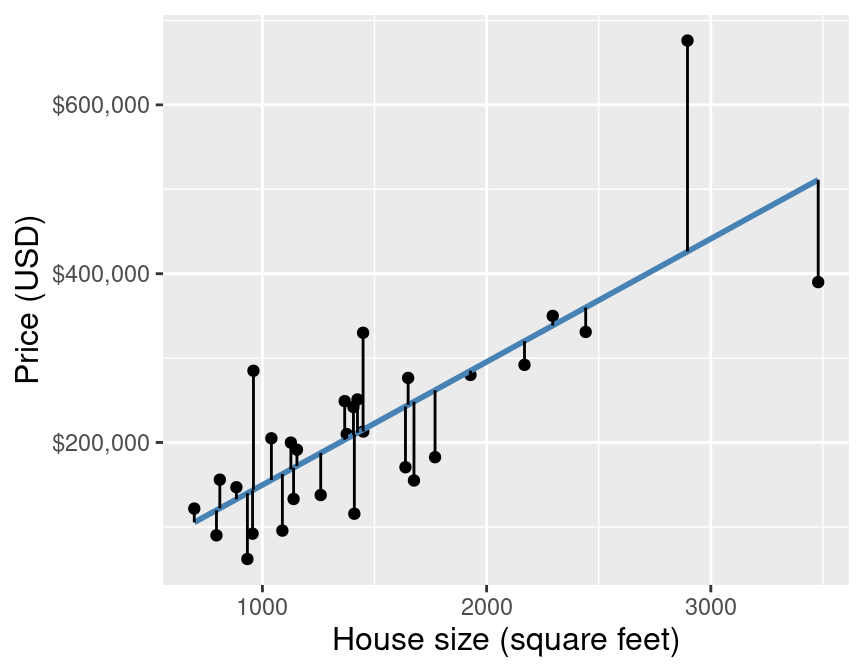
Figure 8.4: Scatter plot of sale price versus size with red lines denoting the vertical distances between the predicted values and the observed data points.
8.4 Linear regression in R
We can perform simple linear regression in R using tidymodels in a
very similar manner to how we performed K-NN regression.
To do this, instead of creating a nearest_neighbor model specification with
the kknn engine, we use a linear_reg model specification
with the lm engine. Another difference is that we do not need to choose \(K\) in the
context of linear regression, and so we do not need to perform cross-validation.
Below we illustrate how we can use the usual tidymodels workflow to predict house sale
price given house size using a simple linear regression approach using the full
Sacramento real estate data set.
As usual, we start by loading packages, setting the seed, loading data, and putting some test data away in a lock box that we can come back to after we choose our final model. Let’s take care of that now.
library(tidyverse)
library(tidymodels)

set.seed(7)

sacramento <- read_csv("data/sacramento.csv")

sacramento_split <- initial_split(sacramento, prop = 0.75, strata = price)
sacramento_train <- training(sacramento_split)
sacramento_test <- testing(sacramento_split)
Now that we have our training data, we will create the model specification and recipe, and fit our simple linear regression model:
lm_spec <- linear_reg() |>
  set_engine("lm") |>
  set_mode("regression")

lm_recipe <- recipe(price ~ sqft, data = sacramento_train)

lm_fit <- workflow() |>
  add_recipe(lm_recipe) |>
  add_model(lm_spec) |>
  fit(data = sacramento_train)

lm_fit
## ══ Workflow [trained] ══════════
## Preprocessor: Recipe
## Model: linear_reg()
##
## ── Preprocessor ──────────
## 0 Recipe Steps
##
## ── Model ──────────
##
## Call:
## stats::lm(formula = ..y ~ ., data = data)
##
## Coefficients:
## (Intercept) sqft
## 18450.3 134.8Note: An additional difference that you will notice here is that we do not standardize (i.e., scale and center) our predictors. In K-nearest neighbors models, recall that the model fit changes depending on whether we standardize first or not. In linear regression, standardization does not affect the fit (it does affect the coefficients in the equation, though!). So you can standardize if you want—it won’t hurt anything—but if you leave the predictors in their original form, the best fit coefficients are usually easier to interpret afterward.
Our coefficients are (intercept) \(\beta_0=\) 18450 and (slope) \(\beta_1=\) 135. This means that the equation of the line of best fit is
\[\text{house sale price} = 18450 + 135\cdot (\text{house size}).\]
In other words, the model predicts that houses start at $18,450 for 0 square feet, and that every extra square foot increases the cost of the house by $135. Finally, we predict on the test data set to assess how well our model does:
lm_test_results <- lm_fit |>
  predict(sacramento_test) |>
  bind_cols(sacramento_test) |>
  metrics(truth = price, estimate = .pred)

lm_test_results
## # A tibble: 3 × 3
## .metric .estimator .estimate
## <chr> <chr> <dbl>
## 1 rmse standard 88528.
## 2 rsq standard 0.608
## 3 mae standard 61892.Our final model’s test error as assessed by RMSPE is $88,528. Remember that this is in units of the response variable, and here that is US Dollars (USD). Does this mean our model is “good” at predicting house sale price based off of the predictor of home size? Again, answering this is tricky and requires knowledge of how you intend to use the prediction.
To visualize the simple linear regression model, we can plot the predicted house sale price across all possible house sizes we might encounter. Since our model is linear, we only need to compute the predicted price of the minimum and maximum house size, and then connect them with a straight line. We superimpose this prediction line on a scatter plot of the original housing price data, so that we can qualitatively assess if the model seems to fit the data well. Figure 8.5 displays the result.
sqft_prediction_grid <- tibble(
    sqft = c(
        sacramento |> select(sqft) |> min(),
        sacramento |> select(sqft) |> max()
    )
)

sacr_preds <- lm_fit |>
  predict(sqft_prediction_grid) |>
  bind_cols(sqft_prediction_grid)

lm_plot_final <- ggplot(sacramento, aes(x = sqft, y = price)) +
  geom_point(alpha = 0.4) +
  geom_line(data = sacr_preds,
            mapping = aes(x = sqft, y = .pred),
            color = "steelblue",
            linewidth = 1) +
  xlab("House size (square feet)") +
  ylab("Price (USD)") +
  scale_y_continuous(labels = dollar_format()) +
  theme(text = element_text(size = 12))

lm_plot_final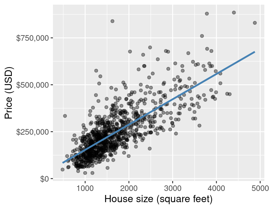
Figure 8.5: Scatter plot of sale price versus size with line of best fit for the full Sacramento housing data.
We can extract the coefficients from our model by accessing the
fit object that is output by the fit function; we first have to extract
it from the workflow using the extract_fit_parsnip function, and then apply
the tidy function to convert the result into a data frame:
## # A tibble: 2 × 5
##   term        estimate std.error statistic   p.value
##   <chr>          <dbl>     <dbl>     <dbl>     <dbl>
## 1 (Intercept)   18450.   7916.        2.33 2.01e-  2
## 2 sqft            135.      4.31     31.2  1.37e-134
8.5 Comparing simple linear and K-NN regression
Now that we have a general understanding of both simple linear and K-NN regression, we can start to compare and contrast these methods as well as the predictions made by them. To start, let’s look at the visualization of the simple linear regression model predictions for the Sacramento real estate data (predicting price from house size) and the “best” K-NN regression model obtained from the same problem, shown in Figure 8.6.
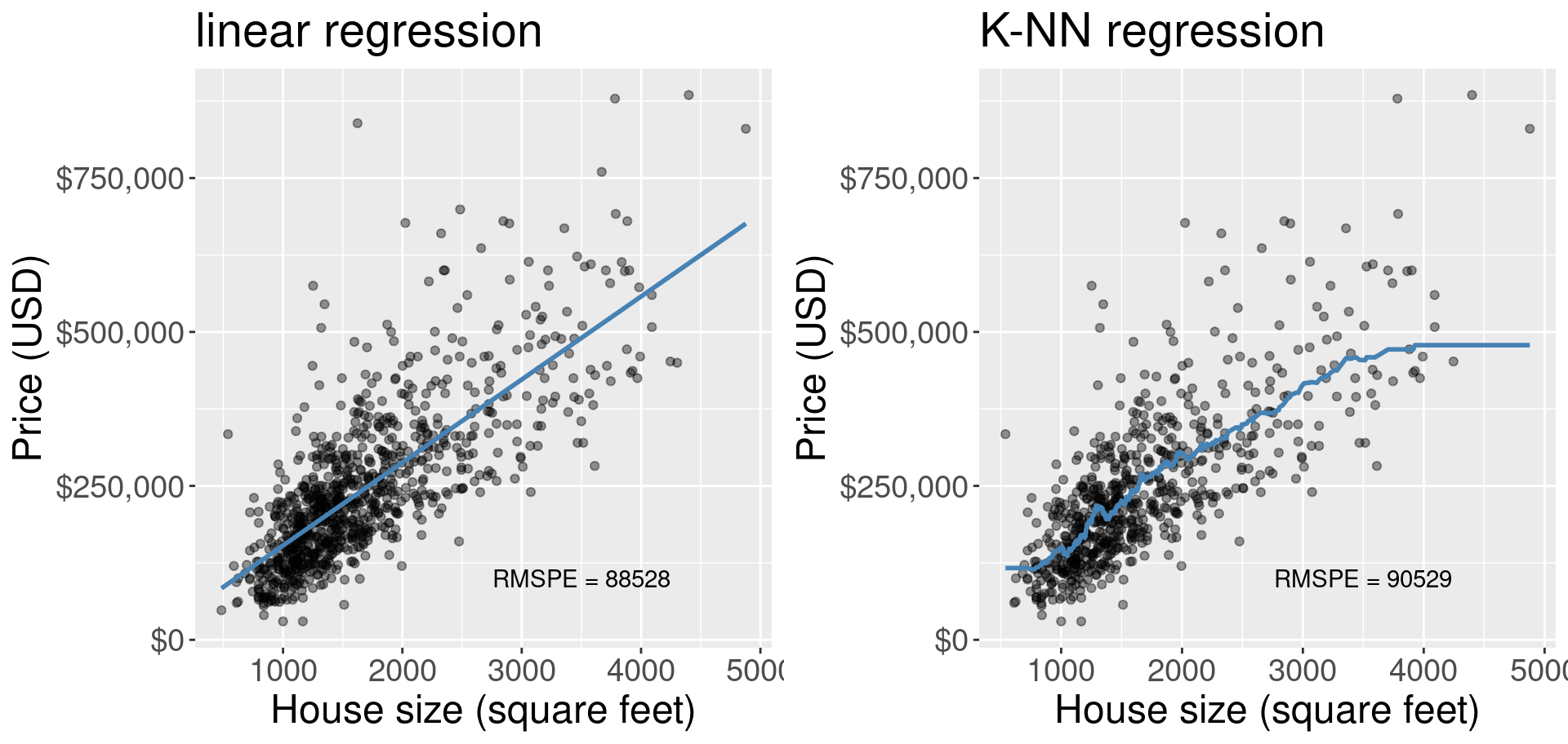
Figure 8.6: Comparison of simple linear regression and K-NN regression.
What differences do we observe in Figure 8.6? One obvious difference is the shape of the blue lines. In simple linear regression we are restricted to a straight line, whereas in K-NN regression our line is much more flexible and can be quite wiggly. But there is a major interpretability advantage in limiting the model to a straight line. A straight line can be defined by two numbers, the vertical intercept and the slope. The intercept tells us what the prediction is when all of the predictors are equal to 0; and the slope tells us what unit increase in the response variable we predict given a unit increase in the predictor variable. K-NN regression, as simple as it is to implement and understand, has no such interpretability from its wiggly line.
There can, however, also be a disadvantage to using a simple linear regression model in some cases, particularly when the relationship between the response and the predictor is not linear, but instead some other shape (e.g., curved or oscillating). In these cases the prediction model from a simple linear regression will underfit, meaning that model/predicted values do not match the actual observed values very well. Such a model would probably have a quite high RMSE when assessing model goodness of fit on the training data and a quite high RMSPE when assessing model prediction quality on a test data set. On such a data set, K-NN regression may fare better. Additionally, there are other types of regression you can learn about in future books that may do even better at predicting with such data.
How do these two models compare on the Sacramento house prices data set? In Figure 8.6, we also printed the RMSPE as calculated from predicting on the test data set that was not used to train/fit the models. The RMSPE for the simple linear regression model is slightly lower than the RMSPE for the K-NN regression model. Considering that the simple linear regression model is also more interpretable, if we were comparing these in practice we would likely choose to use the simple linear regression model.
Finally, note that the K-NN regression model becomes “flat” at the left and right boundaries of the data, while the linear model predicts a constant slope. Predicting outside the range of the observed data is known as extrapolation; K-NN and linear models behave quite differently when extrapolating. Depending on the application, the flat or constant slope trend may make more sense. For example, if our housing data were slightly different, the linear model may have actually predicted a negative price for a small house (if the intercept \(\beta_0\) was negative), which obviously does not match reality. On the other hand, the trend of increasing house size corresponding to increasing house price probably continues for large houses, so the “flat” extrapolation of K-NN likely does not match reality.
8.6 Multivariable linear regression
As in K-NN classification and K-NN regression, we can move beyond the simple case of only one predictor to the case with multiple predictors, known as multivariable linear regression. To do this, we follow a very similar approach to what we did for K-NN regression: we just add more predictors to the model formula in the recipe. But recall that we do not need to use cross-validation to choose any parameters, nor do we need to standardize (i.e., center and scale) the data for linear regression. Note once again that we have the same concerns regarding multiple predictors as in the settings of multivariable K-NN regression and classification: having more predictors is not always better. But because the same predictor selection algorithm from the classification chapter extends to the setting of linear regression, it will not be covered again in this chapter.
We will demonstrate multivariable linear regression using the Sacramento real estate
data with both house size
(measured in square feet) as well as number of bedrooms as our predictors, and
continue to use house sale price as our response variable. We will start by
changing the formula in the recipe to
include both the sqft and beds variables as predictors:
Now we can build our workflow and fit the model:
mlm_fit <- workflow() |>
  add_recipe(mlm_recipe) |>
  add_model(lm_spec) |>
  fit(data = sacramento_train)

mlm_fit
## ══ Workflow [trained] ══════════
## Preprocessor: Recipe
## Model: linear_reg()
##
## ── Preprocessor ──────────
## 0 Recipe Steps
##
## ── Model ──────────
##
## Call:
## stats::lm(formula = ..y ~ ., data = data)
##
## Coefficients:
## (Intercept) sqft beds
## 72547.8 160.6 -29644.3And finally, we make predictions on the test data set to assess the quality of our model:
lm_mult_test_results <- mlm_fit |>
  predict(sacramento_test) |>
  bind_cols(sacramento_test) |>
  metrics(truth = price, estimate = .pred)

lm_mult_test_results
## # A tibble: 3 × 3
## .metric .estimator .estimate
## <chr> <chr> <dbl>
## 1 rmse standard 88739.
## 2 rsq standard 0.603
## 3 mae standard 61732.Our model’s test error as assessed by RMSPE is $88,739. In the case of two predictors, we can plot the predictions made by our linear regression creates a plane of best fit, as shown in Figure 8.7.
Figure 8.7: Linear regression plane of best fit overlaid on top of the data (using price, house size, and number of bedrooms as predictors). Note that in general we recommend against using 3D visualizations; here we use a 3D visualization only to illustrate what the regression plane looks like for learning purposes.
We see that the predictions from linear regression with two predictors form a flat plane. This is the hallmark of linear regression, and differs from the wiggly, flexible surface we get from other methods such as K-NN regression. As discussed, this can be advantageous in one aspect, which is that for each predictor, we can get slopes/intercept from linear regression, and thus describe the plane mathematically. We can extract those slope values from our model object as shown below:
## # A tibble: 3 × 5
## term estimate std.error statistic p.value
## <chr> <dbl> <dbl> <dbl> <dbl>
## 1 (Intercept) 72548. 11670. 6.22 8.76e- 10
## 2 sqft 161. 5.93 27.1 8.34e-111
## 3 beds -29644. 4799. -6.18 1.11e- 9And then use those slopes to write a mathematical equation to describe the prediction plane:
\[\text{house sale price} = \beta_0 + \beta_1\cdot(\text{house size}) + \beta_2\cdot(\text{number of bedrooms}),\] where:
- \(\beta_0\) is the vertical intercept of the hyperplane (the price when both house size and number of bedrooms are 0)
- \(\beta_1\) is the slope for the first predictor (how quickly the price changes as you increase house size, holding number of bedrooms constant)
- \(\beta_2\) is the slope for the second predictor (how quickly the price changes as you increase the number of bedrooms, holding house size constant)
Finally, we can fill in the values for \(\beta_0\), \(\beta_1\) and \(\beta_2\) from the model output above to create the equation of the plane of best fit to the data:
\[\text{house sale price} = 72548 + 161\cdot (\text{house size}) -29644 \cdot (\text{number of bedrooms})\]
This model is more interpretable than the multivariable K-NN regression model; we can write a mathematical equation that explains how each predictor is affecting the predictions. But as always, we should question how well multivariable linear regression is doing compared to the other tools we have, such as simple linear regression and multivariable K-NN regression. If this comparison is part of the model tuning process—for example, if we are trying out many different sets of predictors for multivariable linear and K-NN regression—we must perform this comparison using cross-validation on only our training data. But if we have already decided on a small number (e.g., 2 or 3) of tuned candidate models and we want to make a final comparison, we can do so by comparing the prediction error of the methods on the test data.
## # A tibble: 3 × 3
##   .metric .estimator .estimate
##   <chr>   <chr>          <dbl>
## 1 rmse    standard   88739.
## 2 rsq     standard       0.603
## 3 mae standard 61732.We obtain an RMSPE for the multivariable linear regression model of $88,739.45. This prediction error is less than the prediction error for the multivariable K-NN regression model, indicating that we should likely choose linear regression for predictions of house sale price on this data set. Revisiting the simple linear regression model with only a single predictor from earlier in this chapter, we see that the RMSPE for that model was $88,527.75, which is almost the same as that of our more complex model. As mentioned earlier, this is not always the case: often including more predictors will either positively or negatively impact the prediction performance on unseen test data.
8.7 Multicollinearity and outliers
What can go wrong when performing (possibly multivariable) linear regression? This section will introduce two common issues—outliers and collinear predictors—and illustrate their impact on predictions.
8.7.1 Outliers
Outliers are data points that do not follow the usual pattern of the rest of the data. In the setting of linear regression, these are points that have a vertical distance to the line of best fit that is either much higher or much lower than you might expect based on the rest of the data. The problem with outliers is that they can have too much influence on the line of best fit. In general, it is very difficult to judge accurately which data are outliers without advanced techniques that are beyond the scope of this book.
But to illustrate what can happen when you have outliers, Figure 8.8 shows a small subset of the Sacramento housing data again, except we have added a single data point (highlighted in red). This house is 5,000 square feet in size, and sold for only $50,000. Unbeknownst to the data analyst, this house was sold by a parent to their child for an absurdly low price. Of course, this is not representative of the real housing market values that the other data points follow; the data point is an outlier. In blue we plot the original line of best fit, and in red we plot the new line of best fit including the outlier. You can see how different the red line is from the blue line, which is entirely caused by that one extra outlier data point.
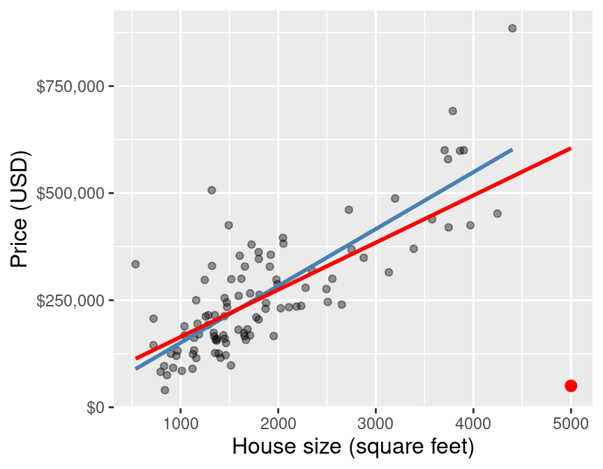
Figure 8.8: Scatter plot of a subset of the data, with outlier highlighted in red.
Fortunately, if you have enough data, the inclusion of one or two outliers—as long as their values are not too wild—will typically not have a large effect on the line of best fit. Figure 8.9 shows how that same outlier data point from earlier influences the line of best fit when we are working with the entire original Sacramento training data. You can see that with this larger data set, the line changes much less when adding the outlier. Nevertheless, it is still important when working with linear regression to critically think about how much any individual data point is influencing the model.
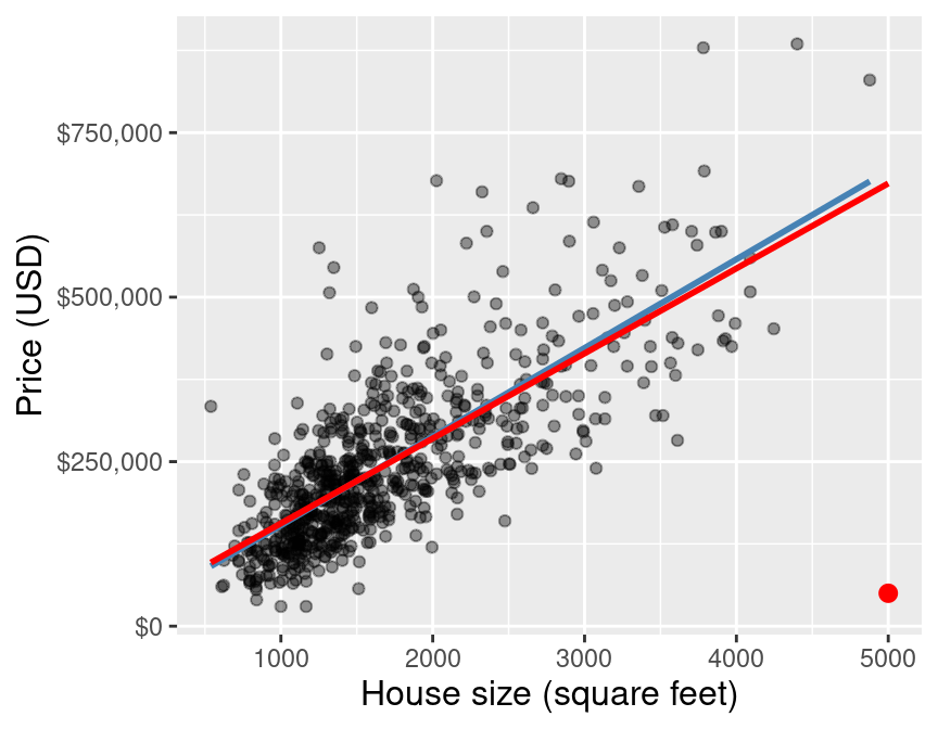
Figure 8.9: Scatter plot of the full data, with outlier highlighted in red.
8.7.2 Multicollinearity
The second, and much more subtle, issue can occur when performing multivariable linear regression. In particular, if you include multiple predictors that are strongly linearly related to one another, the coefficients that describe the plane of best fit can be very unreliable—small changes to the data can result in large changes in the coefficients. Consider an extreme example using the Sacramento housing data where the house was measured twice by two people. Since the two people are each slightly inaccurate, the two measurements might not agree exactly, but they are very strongly linearly related to each other, as shown in Figure 8.10.
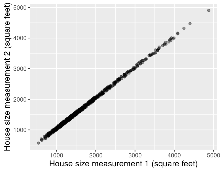
Figure 8.10: Scatter plot of house size (in square feet) measured by person 1 versus house size (in square feet) measured by person 2.
If we again fit the multivariable linear regression model on this data, then the plane of best fit has regression coefficients that are very sensitive to the exact values in the data. For example, if we change the data ever so slightly—e.g., by running cross-validation, which splits up the data randomly into different chunks—the coefficients vary by large amounts:
Best Fit 1: \(\text{house sale price} = 22535 + (220)\cdot (\text{house size 1 (ft$^2$)}) + (-86) \cdot (\text{house size 2 (ft$^2$)}).\)
Best Fit 2: \(\text{house sale price} = 15966 + (86)\cdot (\text{house size 1 (ft$^2$)}) + (49) \cdot (\text{house size 2 (ft$^2$)}).\)
Best Fit 3: \(\text{house sale price} = 17178 + (107)\cdot (\text{house size 1 (ft$^2$)}) + (27) \cdot (\text{house size 2 (ft$^2$)}).\)
Therefore, when performing multivariable linear regression, it is important to avoid including very linearly related predictors. However, techniques for doing so are beyond the scope of this book; see the list of additional resources at the end of this chapter to find out where you can learn more.
8.8 Designing new predictors
We were quite fortunate in our initial exploration to find a predictor variable (house size) that seems to have a meaningful and nearly linear relationship with our response variable (sale price). But what should we do if we cannot immediately find such a nice variable? Well, sometimes it is just a fact that the variables in the data do not have enough of a relationship with the response variable to provide useful predictions. For example, if the only available predictor was “the current house owner’s favorite ice cream flavor”, we likely would have little hope of using that variable to predict the house’s sale price (barring any future remarkable scientific discoveries about the relationship between the housing market and homeowner ice cream preferences). In cases like these, the only option is to obtain measurements of more useful variables.
There are, however, a wide variety of cases where the predictor variables do have a
meaningful relationship with the response variable, but that relationship does not fit
the assumptions of the regression method you have chosen. For example, a data frame df
with two variables—x and y—with a nonlinear relationship between the two variables
will not be fully captured by simple linear regression, as shown in Figure 8.11.
## # A tibble: 100 × 2
##        x      y
##    <dbl>  <dbl>
##  1 0.102 0.0720
##  2 0.800 0.532
##  3 0.478 0.148
##  4 0.972 1.01
##  5 0.846 0.677
##  6 0.405 0.157
##  7 0.879 0.768
##  8 0.130 0.0402
##  9 0.852 0.576
## 10 0.180 0.0847
## # ℹ 90 more rows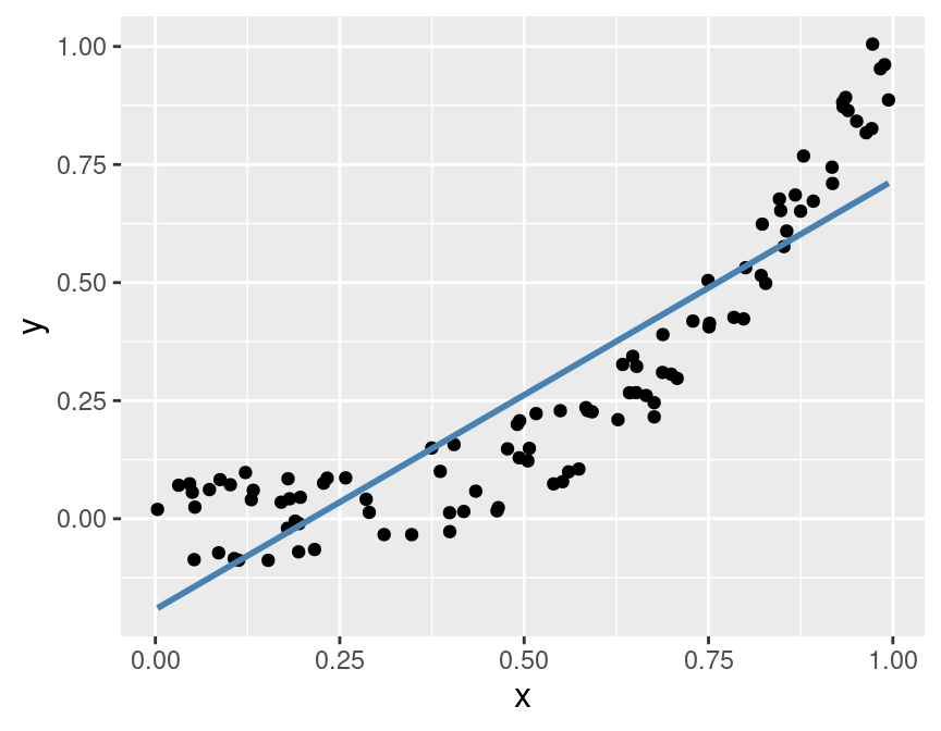
Figure 8.11: Example of a data set with a nonlinear relationship between the predictor and the response.
Instead of trying to predict the response y using a linear regression on x,
we might have some scientific background about our problem to suggest that y
should be a cubic function of x. So before performing regression,
we might create a new predictor variable z using the mutate function:
Then we can perform linear regression for y using the predictor variable z,
as shown in Figure 8.12.
Here you can see that the transformed predictor z helps the
linear regression model make more accurate predictions.
Note that none of the y response values have changed between Figures 8.11
and 8.12; the only change is that the x values
have been replaced by z values.
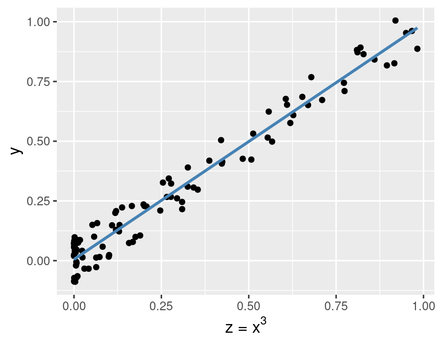
Figure 8.12: Relationship between the transformed predictor and the response.
The process of transforming predictors (and potentially combining multiple predictors in the process) is known as feature engineering. In real data analysis problems, you will need to rely on a deep understanding of the problem—as well as the wrangling tools from previous chapters—to engineer useful new features that improve predictive performance.
Note: Feature engineering is part of tuning your model, and as such you must not use your test data to evaluate the quality of the features you produce. You are free to use cross-validation, though!
8.9 The other sides of regression
So far in this textbook we have used regression only in the context of prediction. However, regression can also be seen as a method to understand and quantify the effects of individual predictor variables on a response variable of interest. In the housing example from this chapter, beyond just using past data to predict future sale prices, we might also be interested in describing the individual relationships of house size and the number of bedrooms with house price, quantifying how strong each of these relationships are, and assessing how accurately we can estimate their magnitudes. And even beyond that, we may be interested in understanding whether the predictors cause changes in the price. These sides of regression are well beyond the scope of this book; but the material you have learned here should give you a foundation of knowledge that will serve you well when moving to more advanced books on the topic.
8.10 Exercises
Practice exercises for the material covered in this chapter can be found in the accompanying worksheets repository in the “Regression II: linear regression” row. You can launch an interactive version of the worksheet in your browser by clicking the “launch binder” button. You can also preview a non-interactive version of the worksheet by clicking “view worksheet.” If you instead decide to download the worksheet and run it on your own machine, make sure to follow the instructions for computer setup found in Chapter 13. This will ensure that the automated feedback and guidance that the worksheets provide will function as intended.
8.11 Additional resources
- The
tidymodelswebsite is an excellent reference for more details on, and advanced usage of, the functions and packages in the past two chapters. Aside from that, it also has a nice beginner’s tutorial and an extensive list of more advanced examples that you can use to continue learning beyond the scope of this book. - Modern Dive (Ismay and Kim 2020) is another textbook that uses the
tidyverse/tidymodelsframework. Chapter 6 complements the material in the current chapter well; it covers some slightly more advanced concepts than we do without getting mathematical. Give this chapter a read before moving on to the next reference. It is also worth noting that this book takes a more “explanatory” / “inferential” approach to regression in general (in Chapters 5, 6, and 10), which provides a nice complement to the predictive tack we take in the present book. - An Introduction to Statistical Learning (James et al. 2013) provides a great next stop in the process of learning about regression. Chapter 3 covers linear regression at a slightly more mathematical level than we do here, but it is not too large a leap and so should provide a good stepping stone. Chapter 6 discusses how to pick a subset of “informative” predictors when you have a data set with many predictors, and you expect only a few of them to be relevant. Chapter 7 covers regression models that are more flexible than linear regression models but still enjoy the computational efficiency of linear regression. In contrast, the K-NN methods we covered earlier are indeed more flexible but become very slow when given lots of data.