 Data Science
Chapter 4 Effective data visualization
4.1 Overview
This chapter will introduce concepts and tools relating to data visualization beyond what we have seen and practiced so far. We will focus on guiding principles for effective data visualization and explaining visualizations independent of any particular tool or programming language. In the process, we will cover some specifics of creating visualizations (scatter plots, bar plots, line plots, and histograms) for data using R.
4.2 Chapter learning objectives
By the end of the chapter, readers will be able to do the following:
- Describe when to use the following kinds of visualizations to answer specific questions using a data set:
- scatter plots
- line plots
- bar plots
- histogram plots
- Given a data set and a question, select from the above plot types and use R to create a visualization that best answers the question.
- Evaluate the effectiveness of a visualization and suggest improvements to better answer a given question.
- Referring to the visualization, communicate the conclusions in non-technical terms.
- Identify rules of thumb for creating effective visualizations.
- Use the
ggplot2package in R to create and refine the above visualizations using:- geometric objects:
geom_point,geom_line,geom_histogram,geom_bar,geom_vline,geom_hline - scales:
xlim,ylim - aesthetic mappings:
x,y,fill,color,shape - labeling:
xlab,ylab,labs - font control and legend positioning:
theme - subplots:
facet_grid
- geometric objects:
- Define the three key aspects of
ggplot2objects:- aesthetic mappings
- geometric objects
- scales
- Describe the difference in raster and vector output formats.
- Use
ggsaveto save visualizations in.pngand.svgformat.
4.3 Choosing the visualization
Ask a question, and answer it
The purpose of a visualization is to answer a question about a data set of interest. So naturally, the first thing to do before creating a visualization is to formulate the question about the data you are trying to answer. A good visualization will clearly answer your question without distraction; a great visualization will suggest even what the question was itself without additional explanation. Imagine your visualization as part of a poster presentation for a project; even if you aren’t standing at the poster explaining things, an effective visualization will convey your message to the audience.
Recall the different data analysis questions from Chapter 1. With the visualizations we will cover in this chapter, we will be able to answer only descriptive and exploratory questions. Be careful to not answer any predictive, inferential, causal or mechanistic questions with the visualizations presented here, as we have not learned the tools necessary to do that properly just yet.
As with most coding tasks, it is totally fine (and quite common) to make mistakes and iterate a few times before you find the right visualization for your data and question. There are many different kinds of plotting graphics available to use (see Chapter 5 of Fundamentals of Data Visualization (Wilke 2019) for a directory). The types of plot that we introduce in this book are shown in Figure 4.1; which one you should select depends on your data and the question you want to answer. In general, the guiding principles of when to use each type of plot are as follows:
- scatter plots visualize the relationship between two quantitative variables
- line plots visualize trends with respect to an independent, ordered quantity (e.g., time)
- bar plots visualize comparisons of amounts
- histograms visualize the distribution of one quantitative variable (i.e., all its possible values and how often they occur)
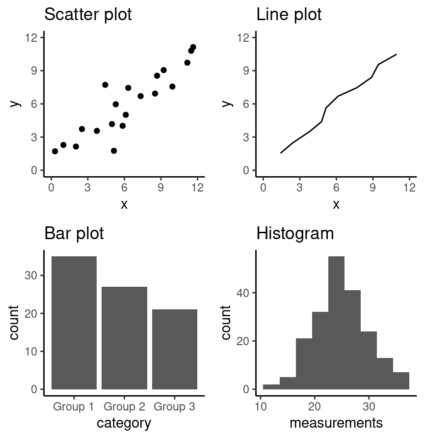
Figure 4.1: Examples of scatter, line and bar plots, as well as histograms.
All types of visualization have their (mis)uses, but three kinds are usually hard to understand or are easily replaced with an oft-better alternative. In particular, you should avoid pie charts; it is generally better to use bars, as it is easier to compare bar heights than pie slice sizes. You should also not use 3-D visualizations, as they are typically hard to understand when converted to a static 2-D image format. Finally, do not use tables to make numerical comparisons; humans are much better at quickly processing visual information than text and math. Bar plots are again typically a better alternative.
4.4 Refining the visualization
Convey the message, minimize noise
Just being able to make a visualization in R (or any other language, for that matter) doesn’t mean that it effectively communicates your message to others. Once you have selected a broad type of visualization to use, you will have to refine it to suit your particular need. Some rules of thumb for doing this are listed below. They generally fall into two classes: you want to make your visualization convey your message, and you want to reduce visual noise as much as possible. Humans have limited cognitive ability to process information; both of these types of refinement aim to reduce the mental load on your audience when viewing your visualization, making it easier for them to understand and remember your message quickly.
Convey the message
- Make sure the visualization answers the question you have asked most simply and plainly as possible.
- Use legends and labels so that your visualization is understandable without reading the surrounding text.
- Ensure the text, symbols, lines, etc., on your visualization are big enough to be easily read.
- Ensure the data are clearly visible; don’t hide the shape/distribution of the data behind other objects (e.g., a bar).
- Make sure to use color schemes that are understandable by those with
colorblindness (a surprisingly large fraction of the overall
population—from about 1% to 10%, depending on sex and ancestry (Deeb 2005)).
For example, ColorBrewer
and the
RColorBrewerR package (Neuwirth 2014) provide the ability to pick such color schemes, and you can check your visualizations after you have created them by uploading to online tools such as a color blindness simulator. - Redundancy can be helpful; sometimes conveying the same message in multiple ways reinforces it for the audience.
Minimize noise
- Use colors sparingly. Too many different colors can be distracting, create false patterns, and detract from the message.
- Be wary of overplotting. Overplotting is when marks that represent the data overlap, and is problematic as it prevents you from seeing how many data points are represented in areas of the visualization where this occurs. If your plot has too many dots or lines and starts to look like a mess, you need to do something different.
- Only make the plot area (where the dots, lines, bars are) as big as needed. Simple plots can be made small.
- Don’t adjust the axes to zoom in on small differences. If the difference is small, show that it’s small!
4.5 Creating visualizations with ggplot2
Build the visualization iteratively
This section will cover examples of how to choose and refine a visualization
given a data set and a question that you want to answer, and then how to create
the visualization in R using the ggplot2 R package. Given that
the ggplot2 package is loaded by the tidyverse metapackage, we still
need to load only `tidyverse’:
4.5.1 Scatter plots and line plots: the Mauna Loa CO2 data set
The Mauna Loa CO2 data set, curated by Dr. Pieter Tans, NOAA/GML and Dr. Ralph Keeling, Scripps Institution of Oceanography, records the atmospheric concentration of carbon dioxide (CO2, in parts per million) at the Mauna Loa research station in Hawaii from 1959 onward (Tans and Keeling 2020). For this book, we are going to focus on the years 1980-2020.
Question: Does the concentration of atmospheric CO2 change over time, and are there any interesting patterns to note?
To get started, we will read and inspect the data:
## # A tibble: 484 × 2
##    date_measured   ppm
##    <date>        <dbl>
##  1 1980-02-01     338.
##  2 1980-03-01     340.
##  3 1980-04-01     341.
##  4 1980-05-01     341.
##  5 1980-06-01     341.
##  6 1980-07-01     339.
##  7 1980-08-01     338.
##  8 1980-09-01     336.
##  9 1980-10-01     336.
## 10 1980-11-01     337.
## # ℹ 474 more rows
We see that there are two columns in the co2_df data frame; date_measured and ppm.
The date_measured column holds the date the measurement was taken,
and is of type date.
The ppm column holds the value of CO2 in parts per million
that was measured on each date, and is type double.
Note:
read_csvwas able to parse thedate_measuredcolumn into thedatevector type because it was entered in the international standard date format, called ISO 8601, which lists dates asyear-month-day.datevectors aredoublevectors with special properties that allow them to handle dates correctly. For example,datetype vectors allow functions likeggplotto treat them as numeric dates and not as character vectors, even though they contain non-numeric characters (e.g., in thedate_measuredcolumn in theco2_dfdata frame). This means R will not accidentally plot the dates in the wrong order (i.e., not alphanumerically as would happen if it was a character vector). An in-depth study of dates and times is beyond the scope of the book, but interested readers may consult the Dates and Times chapter of R for Data Science (Wickham and Grolemund 2016); see the additional resources at the end of this chapter.
Since we are investigating a relationship between two variables
(CO2 concentration and date),
a scatter plot is a good place to start.
Scatter plots show the data as individual points with x (horizontal axis)
and y (vertical axis) coordinates.
Here, we will use the measurement date as the x coordinate
and the CO2 concentration as the y coordinate.
When using the ggplot2 package,
we create a plot object with the ggplot function.
There are a few basic aspects of a plot that we need to specify:
- The name of the data frame object to visualize.
- Here, we specify the
co2_dfdata frame.
- Here, we specify the
- The aesthetic mapping, which tells
ggplothow the columns in the data frame map to properties of the visualization.- To create an aesthetic mapping, we use the
aesfunction. - Here, we set the plot
xaxis to thedate_measuredvariable, and the plotyaxis to theppmvariable.
- To create an aesthetic mapping, we use the
- The
+operator, which tellsggplotthat we would like to add another layer to the plot. - The geometric object, which specifies how the mapped data should be displayed.
- To create a geometric object, we use a
geom_*function (see the ggplot reference for a list of geometric objects). - Here, we use the
geom_pointfunction to visualize our data as a scatter plot.
- To create a geometric object, we use a
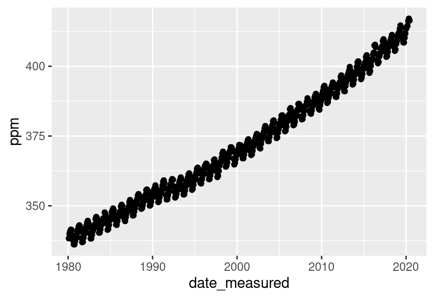
Figure 4.2: Scatter plot of atmospheric concentration of CO2 over time.
The visualization in Figure 4.2 shows a clear upward trend in the atmospheric concentration of CO2 over time. This plot answers the first part of our question in the affirmative, but that appears to be the only conclusion one can make from the scatter visualization.
One important thing to note about this data is that one of the variables
we are exploring is time.
Time is a special kind of quantitative variable
because it forces additional structure on the data—the
data points have a natural order.
Specifically, each observation in the data set has a predecessor
and a successor, and the order of the observations matters; changing their order
alters their meaning.
In situations like this, we typically use a line plot to visualize
the data. Line plots connect the sequence of x and y coordinates
of the observations with line segments, thereby emphasizing their order.
We can create a line plot in ggplot using the geom_line function.
Let’s now try to visualize the co2_df as a line plot
with just the default arguments:
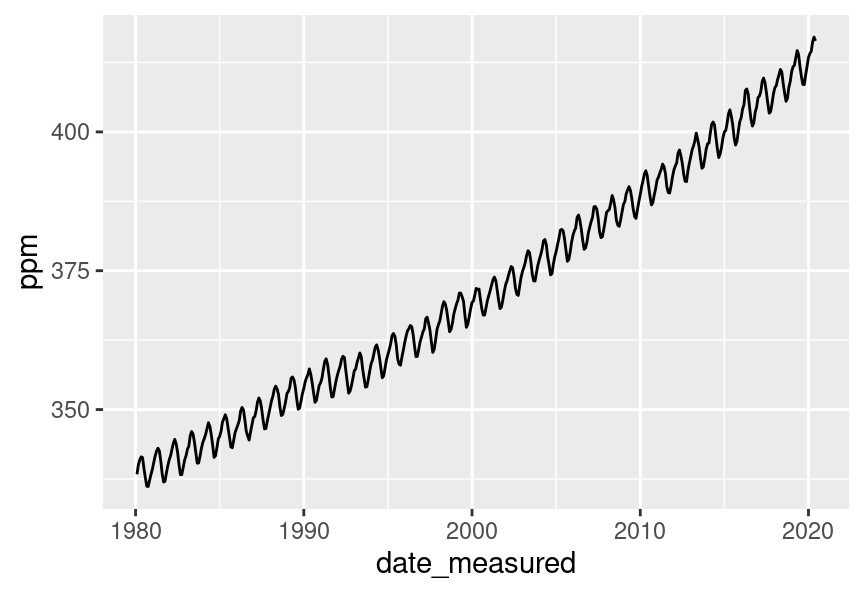
Figure 4.3: Line plot of atmospheric concentration of CO2 over time.
Aha! Figure 4.3 shows us there is another interesting phenomenon in the data: in addition to increasing over time, the concentration seems to oscillate as well. Given the visualization as it is now, it is still hard to tell how fast the oscillation is, but nevertheless, the line seems to be a better choice for answering the question than the scatter plot was. The comparison between these two visualizations also illustrates a common issue with scatter plots: often, the points are shown too close together or even on top of one another, muddling information that would otherwise be clear (overplotting).
Now that we have settled on the rough details of the visualization, it is time
to refine things. This plot is fairly straightforward, and there is not much
visual noise to remove. But there are a few things we must do to improve
clarity, such as adding informative axis labels and making the font a more
readable size. To add axis labels, we use the xlab and ylab functions. To
change the font size, we use the theme function with the text argument:
co2_line <- ggplot(co2_df, aes(x = date_measured, y = ppm)) +
  geom_line() +
  xlab("Year") +
  ylab("Atmospheric CO2 (ppm)") +
  theme(text = element_text(size = 12))

co2_line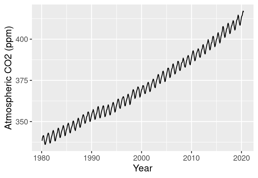
Figure 4.4: Line plot of atmospheric concentration of CO2 over time with clearer axes and labels.
Note: The
themefunction is quite complex and has many arguments that can be specified to control many non-data aspects of a visualization. An in-depth discussion of thethemefunction is beyond the scope of this book. Interested readers may consult thethemefunction documentation; see the additional resources section at the end of this chapter.
Finally, let’s see if we can better understand the oscillation by changing the
visualization slightly. Note that it is totally fine to use a small number of
visualizations to answer different aspects of the question you are trying to
answer. We will accomplish this by using scales,
another important feature of ggplot2 that easily transforms the different
variables and set limits. We scale the horizontal axis using the xlim function,
and the vertical axis with the ylim function.
In particular, here, we will use the xlim function to zoom in
on just five years of data (say, 1990-1994).
xlim takes a vector of length two
to specify the upper and lower bounds to limit the axis.
We can create that using the c function.
Note that it is important that the vector given to xlim must be of the same
type as the data that is mapped to that axis.
Here, we have mapped a date to the x-axis,
and so we need to use the date function
(from the tidyverse lubridate R package (Spinu, Grolemund, and Wickham 2021; Grolemund and Wickham 2011))
to convert the character strings we provide to c to date vectors.
Note:
lubridateis a package that is installed by thetidyversemetapackage, but is not loaded by it. Hence we need to load it separately in the code below.
library(lubridate)

co2_line <- ggplot(co2_df, aes(x = date_measured, y = ppm)) +
  geom_line() +
  xlab("Year") +
  ylab("Atmospheric CO2 (ppm)") +
  xlim(c(date("1990-01-01"), date("1993-12-01"))) +
  theme(text = element_text(size = 12))

co2_line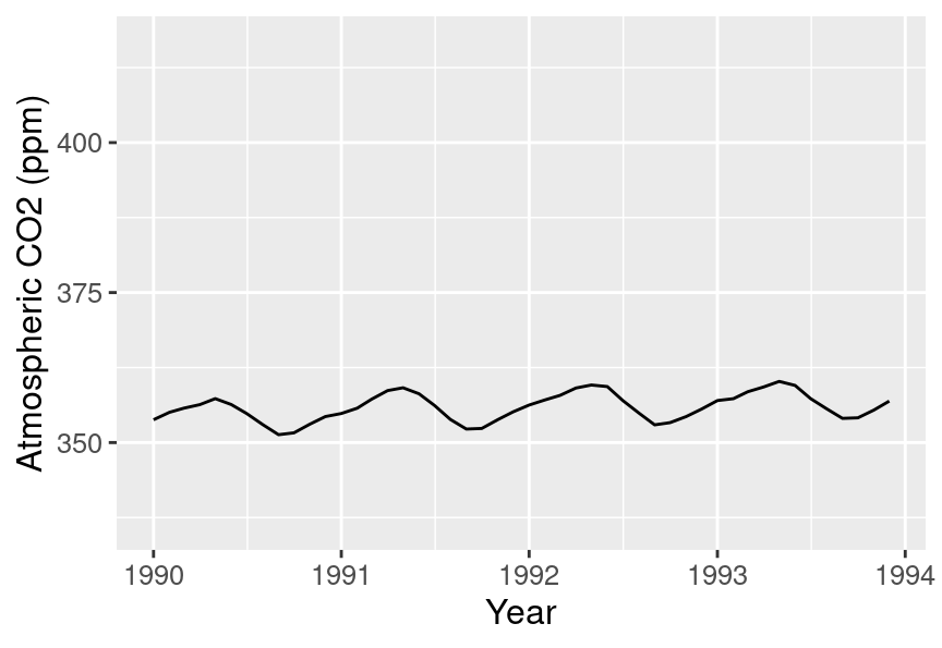
Figure 4.5: Line plot of atmospheric concentration of CO2 from 1990 to 1994.
Interesting! It seems that each year, the atmospheric CO2 increases until it reaches its peak somewhere around April, decreases until around late September, and finally increases again until the end of the year. In Hawaii, there are two seasons: summer from May through October, and winter from November through April. Therefore, the oscillating pattern in CO2 matches up fairly closely with the two seasons.
As you might have noticed from the code used to create the final visualization
of the co2_df data frame,
we construct the visualizations in ggplot with layers.
New layers are added with the + operator,
and we can really add as many as we would like!
A useful analogy to constructing a data visualization is painting a picture.
We start with a blank canvas,
and the first thing we do is prepare the surface
for our painting by adding primer.
In our data visualization this is akin to calling ggplot
and specifying the data set we will be using.
Next, we sketch out the background of the painting.
In our data visualization,
this would be when we map data to the axes in the aes function.
Then we add our key visual subjects to the painting.
In our data visualization,
this would be the geometric objects (e.g., geom_point, geom_line, etc.).
And finally, we work on adding details and refinements to the painting.
In our data visualization this would be when we fine tune axis labels,
change the font, adjust the point size, and do other related things.
4.5.2 Scatter plots: the Old Faithful eruption time data set
The faithful data set contains measurements
of the waiting time between eruptions
and the subsequent eruption duration (in minutes) of the Old Faithful
geyser in Yellowstone National Park, Wyoming, United States.
The faithful data set is available in base R as a data frame,
so it does not need to be loaded.
We convert it to a tibble to take advantage of the nicer print output
these specialized data frames provide.
Question: Is there a relationship between the waiting time before an eruption and the duration of the eruption?
## # A tibble: 272 × 2
##    eruptions waiting
##        <dbl>   <dbl>
##  1      3.6       79
##  2      1.8       54
##  3      3.33      74
##  4      2.28      62
##  5      4.53      85
##  6      2.88      55
##  7      4.7       88
##  8      3.6       85
##  9      1.95      51
## 10      4.35      85
## # ℹ 262 more rows
Here again, we investigate the relationship between two quantitative variables
(waiting time and eruption time).
But if you look at the output of the data frame,
you’ll notice that unlike time in the Mauna Loa CO2 data set,
neither of the variables here have a natural order to them.
So a scatter plot is likely to be the most appropriate
visualization. Let’s create a scatter plot using the ggplot
function with the waiting variable on the horizontal axis, the eruptions
variable on the vertical axis, and the geom_point geometric object.
The result is shown in Figure 4.6.
faithful_scatter <- ggplot(faithful, aes(x = waiting, y = eruptions)) +
  geom_point()

faithful_scatter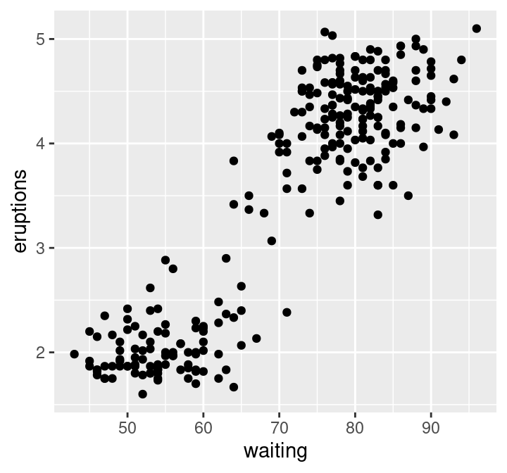
Figure 4.6: Scatter plot of waiting time and eruption time.
We can see in Figure 4.6 that the data tend to fall into two groups: one with short waiting and eruption times, and one with long waiting and eruption times. Note that in this case, there is no overplotting: the points are generally nicely visually separated, and the pattern they form is clear. In order to refine the visualization, we need only to add axis labels and make the font more readable:
faithful_scatter <- ggplot(faithful, aes(x = waiting, y = eruptions)) +
  geom_point() +
  xlab("Waiting Time (mins)") +
  ylab("Eruption Duration (mins)") +
  theme(text = element_text(size = 12))

faithful_scatter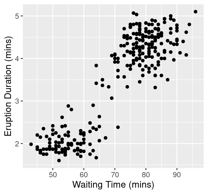
Figure 4.7: Scatter plot of waiting time and eruption time with clearer axes and labels.
4.5.3 Axis transformation and colored scatter plots: the Canadian languages data set
Recall the can_lang data set (Timbers 2020) from Chapters 1, 2, and 3,
which contains counts of languages from the 2016
Canadian census.
Question: Is there a relationship between the percentage of people who speak a language as their mother tongue and the percentage for whom that is the primary language spoken at home? And is there a pattern in the strength of this relationship in the higher-level language categories (Official languages, Aboriginal languages, or non-official and non-Aboriginal languages)?
To get started, we will read and inspect the data:
## # A tibble: 214 × 6
##    category          language mother_tongue most_at_home most_at_work lang_known
##    <chr>             <chr>            <dbl>        <dbl>        <dbl>      <dbl>
##  1 Aboriginal langu… Aborigi…           590          235           30        665
##  2 Non-Official & N… Afrikaa…         10260         4785           85      23415
##  3 Non-Official & N… Afro-As…          1150          445           10       2775
##  4 Non-Official & N… Akan (T…         13460         5985           25      22150
##  5 Non-Official & N… Albanian         26895        13135          345      31930
##  6 Aboriginal langu… Algonqu…            45           10            0        120
##  7 Aboriginal langu… Algonqu…          1260          370           40       2480
##  8 Non-Official & N… America…          2685         3020         1145      21930
##  9 Non-Official & N… Amharic          22465        12785          200      33670
## 10 Non-Official & N… Arabic          419890       223535         5585     629055
## # ℹ 204 more rows
We will begin with a scatter plot of the mother_tongue and most_at_home columns from our data frame.
The resulting plot is shown in Figure 4.8.
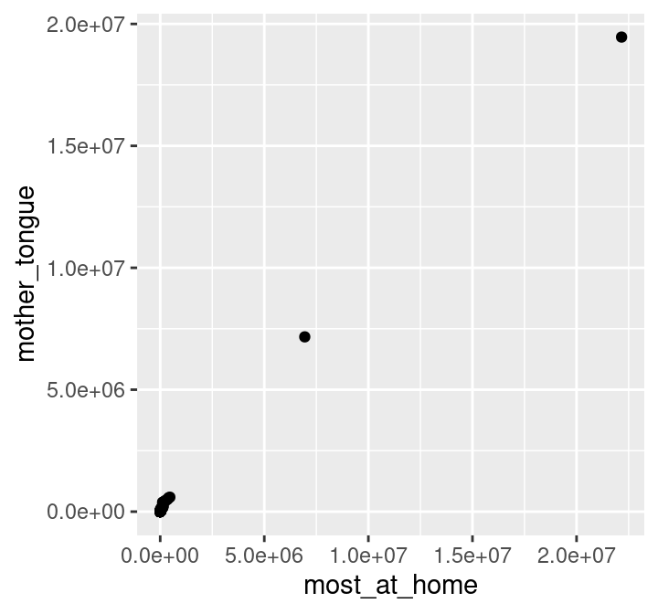
Figure 4.8: Scatter plot of number of Canadians reporting a language as their mother tongue vs the primary language at home.
To make an initial improvement in the interpretability
of Figure 4.8, we should
replace the default axis
names with more informative labels. We can use \n to create a line break in
the axis names so that the words after \n are printed on a new line. This will
make the axes labels on the plots more readable.
We should also increase the font size to further
improve readability.
ggplot(can_lang, aes(x = most_at_home, y = mother_tongue)) +
geom_point() +
xlab("Language spoken most at home \n (number of Canadian residents)") +
ylab("Mother tongue \n (number of Canadian residents)") +
theme(text = element_text(size = 12))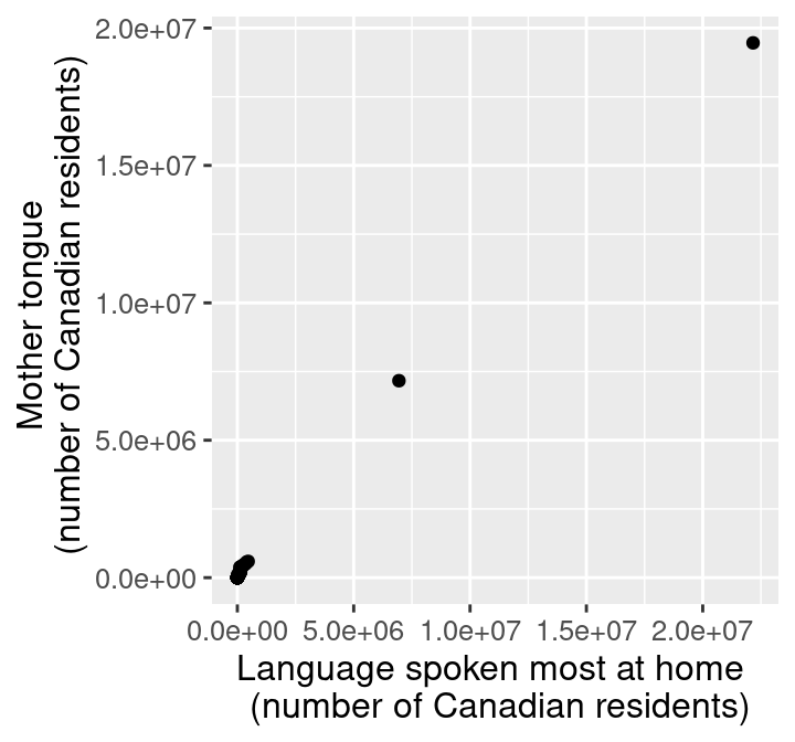
Figure 4.9: Scatter plot of number of Canadians reporting a language as their mother tongue vs the primary language at home with x and y labels.
Okay! The axes and labels in Figure 4.9 are much more readable and interpretable now. However, the scatter points themselves could use some work; most of the 214 data points are bunched up in the lower left-hand side of the visualization. The data is clumped because many more people in Canada speak English or French (the two points in the upper right corner) than other languages. In particular, the most common mother tongue language has 19,460,850 speakers, while the least common has only 10. That’s a 6-decimal-place difference in the magnitude of these two numbers! We can confirm that the two points in the upper right-hand corner correspond to Canada’s two official languages by filtering the data:
## # A tibble: 2 × 6
## category language mother_tongue most_at_home most_at_work lang_known
## <chr> <chr> <dbl> <dbl> <dbl> <dbl>
## 1 Official languages English 19460850 22162865 15265335 29748265
## 2 Official languages French 7166700 6943800 3825215 10242945Recall that our question about this data pertains to all languages;
so to properly answer our question,
we will need to adjust the scale of the axes so that we can clearly
see all of the scatter points.
In particular, we will improve the plot by adjusting the horizontal
and vertical axes so that they are on a logarithmic (or log) scale.
Log scaling is useful when your data take both very large and very small values,
because it helps space out small values and squishes larger values together.
For example, log10(1)=0, log10(10)=1, log10(100)=2, and log10(1000)=3;
on the logarithmic scale,
the values 1, 10, 100, and 1000 are all the same distance apart!
So we see that applying this function is moving big values closer together
and moving small values farther apart.
Note that if your data can take the value 0, logarithmic scaling may not
be appropriate (since log10(0) is -Inf in R). There are other ways to transform
the data in such a case, but these are beyond the scope of the book.
We can accomplish logarithmic scaling in a ggplot visualization
using the scale_x_log10 and scale_y_log10 functions.
Given that the x and y axes have large numbers, we should also format the axis labels
to put commas in these numbers to increase their readability.
We can do this in R by passing the label_comma function (from the scales package)
to the labels argument of the scale_x_log10 and scale_x_log10 functions.
library(scales)
ggplot(can_lang, aes(x = most_at_home, y = mother_tongue)) +
  geom_point() +
  xlab("Language spoken most at home \n (number of Canadian residents)") +
  ylab("Mother tongue \n (number of Canadian residents)") +
theme(text = element_text(size = 12)) +
scale_x_log10(labels = label_comma()) +
scale_y_log10(labels = label_comma())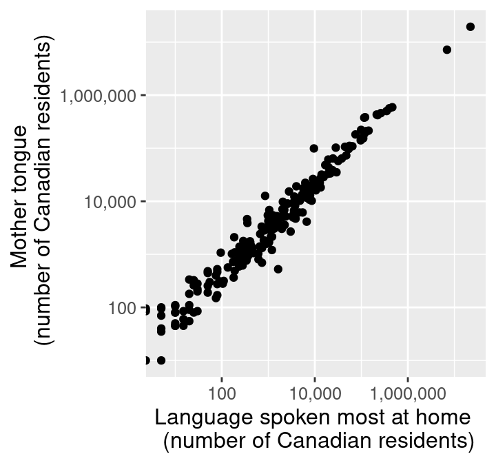
Figure 4.10: Scatter plot of number of Canadians reporting a language as their mother tongue vs the primary language at home with log adjusted x and y axes.
Similar to some of the examples in Chapter 3, we can convert the counts to percentages to give them context and make them easier to understand. We can do this by dividing the number of people reporting a given language as their mother tongue or primary language at home by the number of people who live in Canada and multiplying by 100%. For example, the percentage of people who reported that their mother tongue was English in the 2016 Canadian census was 19,460,850 / 35,151,728 × 100 % = 55.36%.
Below we use mutate to calculate the percentage of people reporting a given
language as their mother tongue and primary language at home for all the
languages in the can_lang data set. Since the new columns are appended to the
end of the data table, we selected the new columns after the transformation so
you can clearly see the mutated output from the table.
can_lang <- can_lang |>
  mutate(
    mother_tongue_percent = (mother_tongue / 35151728) * 100,
    most_at_home_percent = (most_at_home / 35151728) * 100
  )

can_lang |>
  select(mother_tongue_percent, most_at_home_percent)
## # A tibble: 214 × 2
## mother_tongue_percent most_at_home_percent
## <dbl> <dbl>
## 1 0.00168 0.000669
## 2 0.0292 0.0136
## 3 0.00327 0.00127
## 4 0.0383 0.0170
## 5 0.0765 0.0374
## 6 0.000128 0.0000284
## 7 0.00358 0.00105
## 8 0.00764 0.00859
## 9 0.0639 0.0364
## 10 1.19 0.636
## # ℹ 204 more rowsFinally, we will edit the visualization to use the percentages we just computed (and change our axis labels to reflect this change in units). Figure 4.11 displays the final result.
ggplot(can_lang, aes(x = most_at_home_percent, y = mother_tongue_percent)) +
  geom_point() +
  xlab("Language spoken most at home \n (percentage of Canadian residents)") +
  ylab("Mother tongue \n (percentage of Canadian residents)") +
  theme(text = element_text(size = 12)) +
  scale_x_log10(labels = comma) +
  scale_y_log10(labels = comma)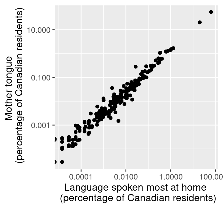
Figure 4.11: Scatter plot of percentage of Canadians reporting a language as their mother tongue vs the primary language at home.
Figure 4.11 is the appropriate visualization to use to answer the first question in this section, i.e., whether there is a relationship between the percentage of people who speak a language as their mother tongue and the percentage for whom that is the primary language spoken at home. To fully answer the question, we need to use Figure 4.11 to assess a few key characteristics of the data:
- Direction: if the y variable tends to increase when the x variable increases, then y has a positive relationship with x. If y tends to decrease when x increases, then y has a negative relationship with x. If y does not meaningfully increase or decrease as x increases, then y has little or no relationship with x.
- Strength: if the y variable reliably increases, decreases, or stays flat as x increases, then the relationship is strong. Otherwise, the relationship is weak. Intuitively, the relationship is strong when the scatter points are close together and look more like a “line” or “curve” than a “cloud.”
- Shape: if you can draw a straight line roughly through the data points, the relationship is linear. Otherwise, it is nonlinear.
In Figure 4.11, we see that as the percentage of people who have a language as their mother tongue increases, so does the percentage of people who speak that language at home. Therefore, there is a positive relationship between these two variables. Furthermore, because the points in Figure 4.11 are fairly close together, and the points look more like a “line” than a “cloud”, we can say that this is a strong relationship. And finally, because drawing a straight line through these points in Figure 4.11 would fit the pattern we observe quite well, we say that the relationship is linear.
Onto the second part of our exploratory data analysis question! Recall that we are interested in knowing whether the strength of the relationship we uncovered in Figure 4.11 depends on the higher-level language category (Official languages, Aboriginal languages, and non-official, non-Aboriginal languages). One common way to explore this is to color the data points on the scatter plot we have already created by group. For example, given that we have the higher-level language category for each language recorded in the 2016 Canadian census, we can color the points in our previous scatter plot to represent each language’s higher-level language category.
Here we want to distinguish the values according to the category group with
which they belong. We can add an argument to the aes function, specifying
that the category column should color the points. Adding this argument will
color the points according to their group and add a legend at the side of the
plot.
ggplot(can_lang, aes(x = most_at_home_percent,
                     y = mother_tongue_percent,
                     color = category)) +
  geom_point() +
  xlab("Language spoken most at home \n (percentage of Canadian residents)") +
  ylab("Mother tongue \n (percentage of Canadian residents)") +
  theme(text = element_text(size = 12)) +
  scale_x_log10(labels = comma) +
  scale_y_log10(labels = comma)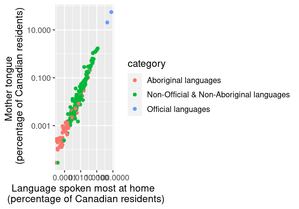
Figure 4.12: Scatter plot of percentage of Canadians reporting a language as their mother tongue vs the primary language at home colored by language category.
The legend in Figure 4.12
takes up valuable plot area.
We can improve this by moving the legend title using the legend.position
and legend.direction
arguments of the theme function.
Here we set legend.position to "top" to put the legend above the plot
and legend.direction to "vertical" so that the legend items remain
vertically stacked on top of each other.
When the legend.position is set to either "top" or "bottom"
the default direction is to stack the legend items horizontally.
However, that will not work well for this particular visualization
because the legend labels are quite long
and would run off the page if displayed this way.
ggplot(can_lang, aes(x = most_at_home_percent,
                     y = mother_tongue_percent,
                     color = category)) +
  geom_point() +
  xlab("Language spoken most at home \n (percentage of Canadian residents)") +
  ylab("Mother tongue \n (percentage of Canadian residents)") +
  theme(text = element_text(size = 12),
        legend.position = "top",
        legend.direction = "vertical") +
  scale_x_log10(labels = comma) +
  scale_y_log10(labels = comma)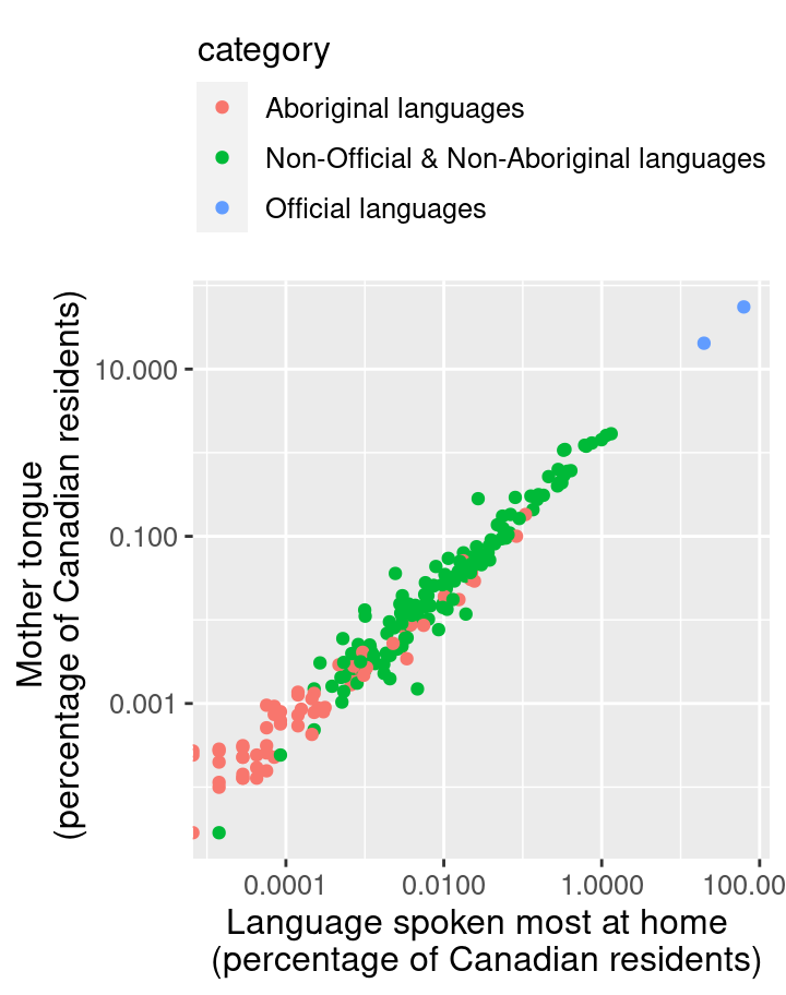
Figure 4.13: Scatter plot of percentage of Canadians reporting a language as their mother tongue vs the primary language at home colored by language category with the legend edited.
In Figure 4.13, the points are colored with
the default ggplot2 color palette. But what if you want to use different
colors? In R, two packages that provide alternative color
palettes are RColorBrewer (Neuwirth 2014)
and ggthemes (Arnold 2019); in this book we will cover how to use RColorBrewer.
You can visualize the list of color
palettes that RColorBrewer has to offer with the display.brewer.all
function. You can also print a list of color-blind friendly palettes by adding
colorblindFriendly = TRUE to the function.
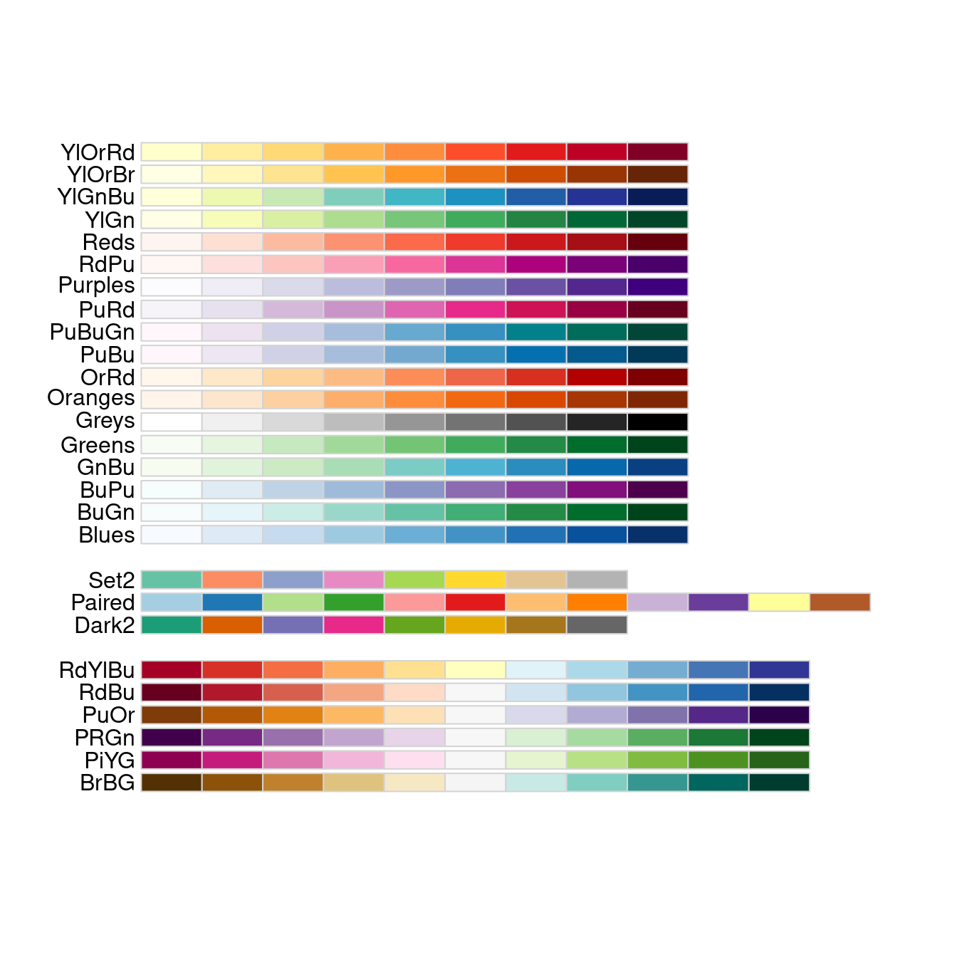
Figure 4.14: Color palettes available from the RColorBrewer R package.
From Figure 4.14,
we can choose the color palette we want to use in our plot.
To change the color palette,
we add the scale_color_brewer layer indicating the palette we want to use.
You can use
this color blindness simulator to check
if your visualizations
are color-blind friendly.
Below we pick the "Set2" palette, with the result shown
in Figure 4.15.
We also set the shape aesthetic mapping to the category variable as well;
this makes the scatter point shapes different for each category. This kind of
visual redundancy—i.e., conveying the same information with both scatter point color and shape—can
further improve the clarity and accessibility of your visualization.
ggplot(can_lang, aes(x = most_at_home_percent,
                     y = mother_tongue_percent,
                     color = category,
                     shape = category)) +
  geom_point() +
  xlab("Language spoken most at home \n (percentage of Canadian residents)") +
  ylab("Mother tongue \n (percentage of Canadian residents)") +
  theme(text = element_text(size = 12),
        legend.position = "top",
        legend.direction = "vertical") +
  scale_x_log10(labels = comma) +
  scale_y_log10(labels = comma) +
  scale_color_brewer(palette = "Set2")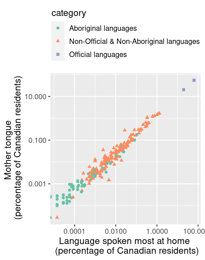
Figure 4.15: Scatter plot of percentage of Canadians reporting a language as their mother tongue vs the primary language at home colored by language category with color-blind friendly colors.
From the visualization in Figure 4.15, we can now clearly see that the vast majority of Canadians reported one of the official languages as their mother tongue and as the language they speak most often at home. What do we see when considering the second part of our exploratory question? Do we see a difference in the relationship between languages spoken as a mother tongue and as a primary language at home across the higher-level language categories? Based on Figure 4.15, there does not appear to be much of a difference. For each higher-level language category, there appears to be a strong, positive, and linear relationship between the percentage of people who speak a language as their mother tongue and the percentage who speak it as their primary language at home. The relationship looks similar regardless of the category.
Does this mean that this relationship is positive for all languages in the world? And further, can we use this data visualization on its own to predict how many people have a given language as their mother tongue if we know how many people speak it as their primary language at home? The answer to both these questions is “no!” However, with exploratory data analysis, we can create new hypotheses, ideas, and questions (like the ones at the beginning of this paragraph). Answering those questions often involves doing more complex analyses, and sometimes even gathering additional data. We will see more of such complex analyses later on in this book.
4.5.4 Bar plots: the island landmass data set
The islands.csv data set contains a list of Earth’s landmasses as well as their area (in thousands of square miles) (McNeil 1977).
Question: Are the continents (North / South America, Africa, Europe, Asia, Australia, Antarctica) Earth’s seven largest landmasses? If so, what are the next few largest landmasses after those?
To get started, we will read and inspect the data:
## # A tibble: 48 × 3
##    landmass      size landmass_type
##    <chr>        <dbl> <chr>
##  1 Africa       11506 Continent
##  2 Antarctica    5500 Continent
##  3 Asia         16988 Continent
##  4 Australia     2968 Continent
##  5 Axel Heiberg    16 Other
##  6 Baffin         184 Other
##  7 Banks           23 Other
##  8 Borneo         280 Other
##  9 Britain         84 Other
## 10 Celebes         73 Other
## # ℹ 38 more rows
Here, we have a data frame of Earth’s landmasses, and are trying to compare their sizes. The right type of visualization to answer this question is a bar plot. In a bar plot, the height of each bar represents the value of an amount (a size, count, proportion, percentage, etc). They are particularly useful for comparing counts or proportions across different groups of a categorical variable. Note, however, that bar plots should generally not be used to display mean or median values, as they hide important information about the variation of the data. Instead it’s better to show the distribution of all the individual data points, e.g., using a histogram, which we will discuss further in Section 4.5.5.
We specify that we would like to use a bar plot
via the geom_bar function in ggplot2.
However, by default, geom_bar sets the heights
of bars to the number of times a value appears in a data frame (its count); here, we want to plot exactly the values in the data frame, i.e.,
the landmass sizes. So we have to pass the stat = "identity" argument to geom_bar. The result is
shown in Figure 4.16.
islands_bar <- ggplot(islands_df, aes(x = landmass, y = size)) +
  geom_bar(stat = "identity")

islands_bar
Figure 4.16: Bar plot of Earth’s landmass sizes with squished labels.
Alright, not bad! The plot in Figure 4.16 is
definitely the right kind of visualization, as we can clearly see and compare
sizes of landmasses. The major issues are that the smaller landmasses’ sizes
are hard to distinguish, and the names of the landmasses are obscuring each
other as they have been squished into too little space. But remember that the
question we asked was only about the largest landmasses; let’s make the plot a
little bit clearer by keeping only the largest 12 landmasses. We do this using
the slice_max function: the order_by argument is the name of the column we
want to use for comparing which is largest, and the n argument specifies how many
rows to keep. Then to give the labels enough
space, we’ll use horizontal bars instead of vertical ones. We do this by
swapping the x and y variables.
Note: Recall that in Chapter 1, we used
arrangefollowed bysliceto obtain the ten rows with the largest values of a variable. We could have instead used theslice_maxfunction for this purpose. Theslice_maxandslice_minfunctions achieve the same goal asarrangefollowed byslice, but are slightly more efficient because they are specialized for this purpose. In general, it is good to use more specialized functions when they are available!
islands_top12 <- slice_max(islands_df, order_by = size, n = 12)
islands_bar <- ggplot(islands_top12, aes(x = size, y = landmass)) +
  geom_bar(stat = "identity")

islands_bar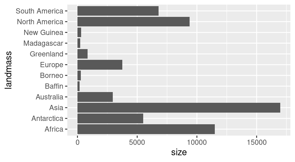
Figure 4.17: Bar plot of size for Earth’s largest 12 landmasses.
The plot in Figure 4.17 is definitely clearer now,
and allows us to answer our question
(“Are the top 7 largest landmasses continents?”) in the affirmative.
However, we could still improve this visualization by
coloring the bars based on whether they correspond to a continent,
and by organizing the bars by landmass size rather than by alphabetical order.
The data for coloring the bars is stored in the landmass_type column,
so we add the fill argument to the aesthetic mapping
and set it to landmass_type. We manually select two colors for the bars
using the scale_fill_manual function:"darkorange"
for orange and "steelblue" for blue.
To organize the landmasses by their size variable,
we will use the tidyverse fct_reorder function
in the aesthetic mapping to organize the landmasses by their size variable.
The first argument passed to fct_reorder is the name of the factor column
whose levels we would like to reorder (here, landmass).
The second argument is the column name
that holds the values we would like to use to do the ordering (here, size).
The fct_reorder function uses ascending order by default,
but this can be changed to descending order
by setting .desc = TRUE.
We do this here so that the largest bar will be closest to the axis line,
which is more visually appealing.
To finalize this plot we will customize the axis and legend labels, and add a title to the chart. Plot titles are not always required, especially when it would be redundant with an already-existing caption or surrounding context (e.g., in a slide presentation with annotations). But if you decide to include one, a good plot title should provide the take home message that you want readers to focus on, e.g., “Earth’s seven largest landmasses are continents,” or a more general summary of the information displayed, e.g., “Earth’s twelve largest landmasses.”
To make these final adjustments we will use the labs function rather than the xlab and ylab functions
we have seen earlier in this chapter, as labs lets us modify the legend label and title in addition to axis labels.
We provide a label for each aesthetic mapping in the plot—in this case, x, y, and fill—as well as one for the title argument.
Finally, we again use the theme function
to change the font size.
islands_bar <- ggplot(islands_top12,
                      aes(x = size,
                          y = fct_reorder(landmass, size, .desc = TRUE),
                          fill = landmass_type)) +
  geom_bar(stat = "identity") +
  labs(x = "Size (1000 square mi)",
       y = "Landmass",
       fill = "Type",
       title = "Earth's twelve largest landmasses") +
  scale_fill_manual(values = c("steelblue", "darkorange")) +
  theme(text = element_text(size = 10))

islands_bar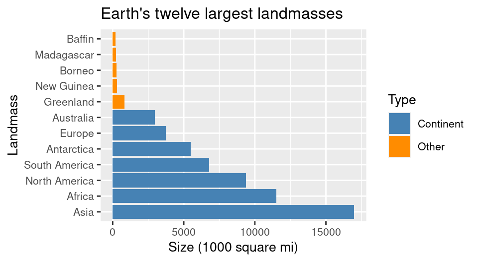
Figure 4.18: Bar plot of size for Earth’s largest 12 landmasses, colored by landmass type, with clearer axes and labels.
The plot in Figure 4.18 is now a very effective visualization for answering our original questions. Landmasses are organized by their size, and continents are colored differently than other landmasses, making it quite clear that continents are the largest seven landmasses.
4.5.5 Histograms: the Michelson speed of light data set
The morley data set
contains measurements of the speed of light
collected in experiments performed in 1879.
Five experiments were performed,
and in each experiment, 20 runs were performed—meaning that
20 measurements of the speed of light were collected
in each experiment (Michelson 1882).
The morley data set is available in base R as a data frame,
so it does not need to be loaded.
Because the speed of light is a very large number
(the true value is 299,792.458 km/sec), the data is coded
to be the measured speed of light minus 299,000.
This coding allows us to focus on the variations in the measurements, which are generally
much smaller than 299,000.
If we used the full large speed measurements, the variations in the measurements
would not be noticeable, making it difficult to study the differences between the experiments.
Note that we convert the morley data to a tibble to take advantage of the nicer print output
these specialized data frames provide.
Question: Given what we know now about the speed of light (299,792.458 kilometres per second), how accurate were each of the experiments?
## # A tibble: 100 × 3
##     Expt   Run Speed
##    <int> <int> <int>
##  1     1     1   850
##  2     1     2   740
##  3     1     3   900
##  4     1     4  1070
##  5     1     5   930
##  6     1     6   850
##  7     1     7   950
##  8     1     8   980
##  9     1     9   980
## 10     1    10   880
## # ℹ 90 more rows
In this experimental data, Michelson was trying to measure just a single quantitative number (the speed of light). The data set contains many measurements of this single quantity. To tell how accurate the experiments were, we need to visualize the distribution of the measurements (i.e., all their possible values and how often each occurs). We can do this using a histogram. A histogram helps us visualize how a particular variable is distributed in a data set by separating the data into bins, and then using vertical bars to show how many data points fell in each bin.
To create a histogram in ggplot2 we will use the geom_histogram geometric
object, setting the x axis to the Speed measurement variable. As usual,
let’s use the default arguments just to see how things look.

Figure 4.19: Histogram of Michelson’s speed of light data.
Figure 4.19 is a great start.
However,
we cannot tell how accurate the measurements are using this visualization
unless we can see the true value.
In order to visualize the true speed of light,
we will add a vertical line with the geom_vline function.
To draw a vertical line with geom_vline,
we need to specify where on the x-axis the line should be drawn.
We can do this by setting the xintercept argument.
Here we set it to 792.458, which is the true value of light speed
minus 299,000; this ensures it is coded the same way as the
measurements in the morley data frame.
We would also like to fine tune this vertical line,
styling it so that it is dashed by setting linetype = "dashed".
There is a similar function, geom_hline,
that is used for plotting horizontal lines.
Note that
vertical lines are used to denote quantities on the horizontal axis,
while horizontal lines are used to denote quantities on the vertical axis.
morley_hist <- ggplot(morley, aes(x = Speed)) +
  geom_histogram() +
  geom_vline(xintercept = 792.458, linetype = "dashed")

morley_hist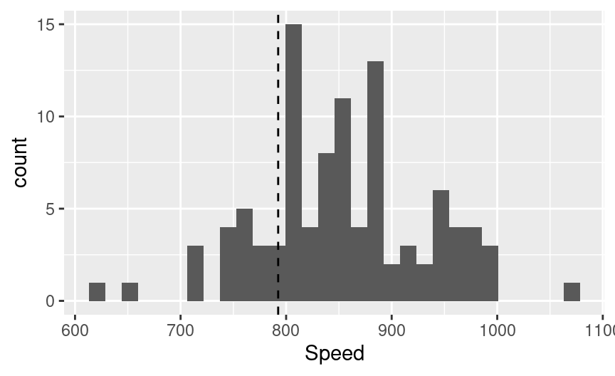
Figure 4.20: Histogram of Michelson’s speed of light data with vertical line indicating true speed of light.
In Figure 4.20,
we still cannot tell which experiments (denoted in the Expt column)
led to which measurements;
perhaps some experiments were more accurate than others.
To fully answer our question,
we need to separate the measurements from each other visually.
We can try to do this using a colored histogram,
where counts from different experiments are stacked on top of each other
in different colors.
We can create a histogram colored by the Expt variable
by adding it to the fill aesthetic mapping.
We make sure the different colors can be seen
(despite them all sitting on top of each other)
by setting the alpha argument in geom_histogram to 0.5
to make the bars slightly translucent.
We also specify position = "identity" in geom_histogram to ensure
the histograms for each experiment will be overlaid side-by-side,
instead of stacked bars
(which is the default for bar plots or histograms
when they are colored by another categorical variable).
morley_hist <- ggplot(morley, aes(x = Speed, fill = Expt)) +
  geom_histogram(alpha = 0.5, position = "identity") +
  geom_vline(xintercept = 792.458, linetype = "dashed")

morley_hist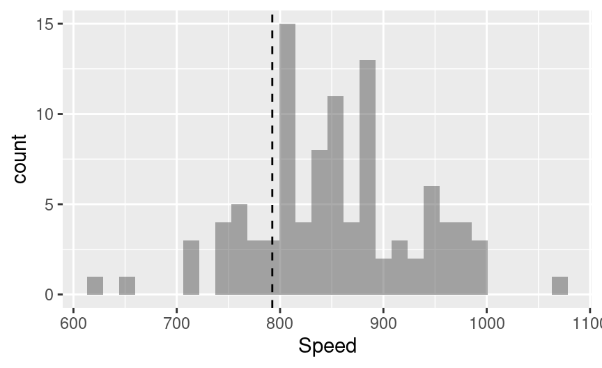
Figure 4.21: Histogram of Michelson’s speed of light data where an attempt is made to color the bars by experiment.
Alright great, Figure 4.21 looks…wait a second! The
histogram is still all the same color! What is going on here? Well, if you
recall from Chapter 3, the data type you use for each variable
can influence how R and tidyverse treats it. Here, we indeed have an issue
with the data types in the morley data frame. In particular, the Expt column
is currently an integer (you can see the label <int> underneath the Expt column in the printed
data frame at the start of this section). But we want to treat it as a
category, i.e., there should be one category per type of experiment.
To fix this issue we can convert the Expt variable into a factor by
passing it to as_factor in the fill aesthetic mapping.
Recall that factor is a data type in R that is often used to represent
categories. By writing
as_factor(Expt) we are ensuring that R will treat this variable as a factor,
and the color will be mapped discretely.
morley_hist <- ggplot(morley, aes(x = Speed, fill = as_factor(Expt))) +
  geom_histogram(alpha = 0.5, position = "identity") +
  geom_vline(xintercept = 792.458, linetype = "dashed")

morley_hist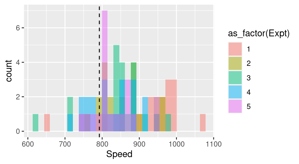
Figure 4.22: Histogram of Michelson’s speed of light data colored by experiment as factor.
Note: Factors impact plots in two ways: (1) ensuring a color is mapped as discretely where appropriate (as in this example) and (2) the ordering of levels in a plot.
ggplottakes into account the order of the factor levels as opposed to the order of data in your data frame. Learning how to reorder your factor levels will help you with reordering the labels of a factor on a plot.
Unfortunately, the attempt to separate out the experiment number visually has created a bit of a mess. All of the colors in Figure 4.22 are blending together, and although it is possible to derive some insight from this (e.g., experiments 1 and 3 had some of the most incorrect measurements), it isn’t the clearest way to convey our message and answer the question. Let’s try a different strategy of creating grid of separate histogram plots.
We use the facet_grid function to create a plot
that has multiple subplots arranged in a grid.
The argument to facet_grid specifies the variable(s) used to split the plot
into subplots, and how to split them (i.e., into rows or columns).
If the plot is to be split horizontally, into rows,
then the rows argument is used.
If the plot is to be split vertically, into columns,
then the cols argument is used.
Both the rows and cols arguments take the column names on which to split the data when creating the subplots.
Note that the column names must be surrounded by the vars function.
This function allows the column names to be correctly evaluated
in the context of the data frame.
morley_hist <- ggplot(morley, aes(x = Speed, fill = as_factor(Expt))) +
  geom_histogram() +
  facet_grid(rows = vars(Expt)) +
  geom_vline(xintercept = 792.458, linetype = "dashed")

morley_hist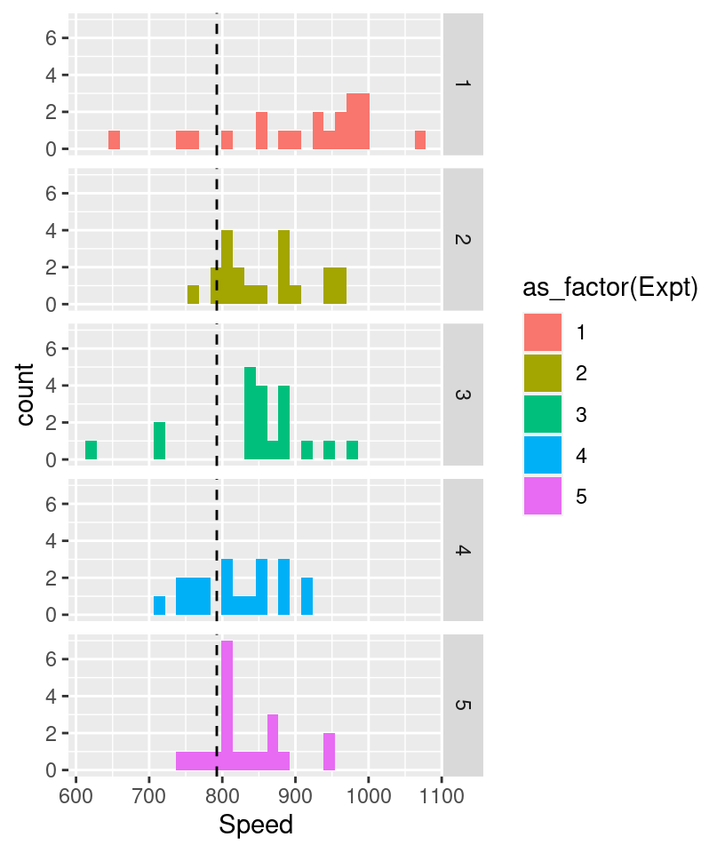
Figure 4.23: Histogram of Michelson’s speed of light data split vertically by experiment.
The visualization in Figure 4.23 now makes it quite clear how accurate the different experiments were with respect to one another. The most variable measurements came from Experiment 1. There the measurements ranged from about 650–1050 km/sec. The least variable measurements came from Experiment 2. There, the measurements ranged from about 750–950 km/sec. The most different experiments still obtained quite similar results!
There are two finishing touches to make this visualization even clearer. First and foremost, we need to add informative axis labels
using the labs function, and increase the font size to make it readable using the theme function. Second, and perhaps more subtly, even though it
is easy to compare the experiments on this plot to one another, it is hard to get a sense
of just how accurate all the experiments were overall. For example, how accurate is the value 800 on the plot, relative to the true speed of light?
To answer this question, we’ll use the mutate function to transform our data into a relative measure of accuracy rather than absolute measurements:
morley_rel <- mutate(morley,
                     relative_accuracy = 100 *
                       ((299000 + Speed) - 299792.458) / (299792.458))

morley_hist <- ggplot(morley_rel,
                      aes(x = relative_accuracy,
                          fill = as_factor(Expt))) +
  geom_histogram() +
  facet_grid(rows = vars(Expt)) +
  geom_vline(xintercept = 0, linetype = "dashed") +
  labs(x = "Relative Accuracy (%)",
       y = "# Measurements",
       fill = "Experiment ID") +
  theme(text = element_text(size = 12))

morley_hist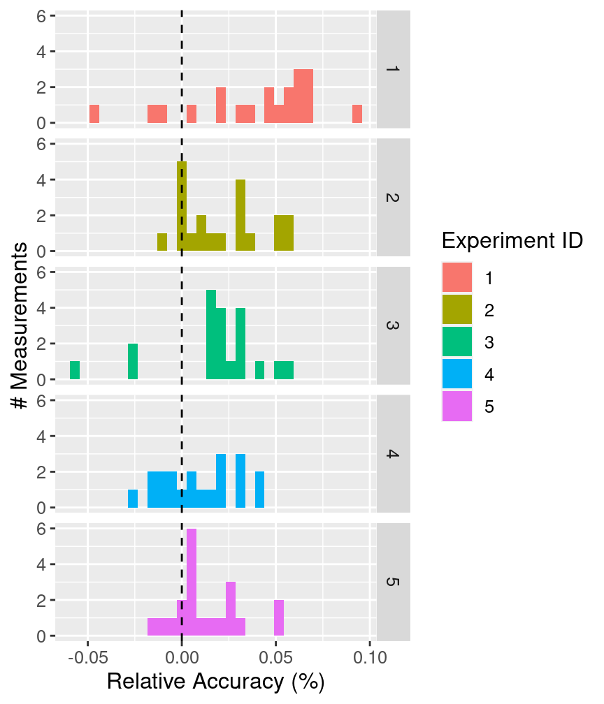
Figure 4.24: Histogram of relative accuracy split vertically by experiment with clearer axes and labels.
Wow, impressive! These measurements of the speed of light from 1879 had errors around 0.05% of the true speed. Figure 4.24 shows you that even though experiments 2 and 5 were perhaps the most accurate, all of the experiments did quite an admirable job given the technology available at the time.
Choosing a binwidth for histograms
When you create a histogram in R, the default number of bins used is 30.
Naturally, this is not always the right number to use.
You can set the number of bins yourself by using
the bins argument in the geom_histogram geometric object.
You can also set the width of the bins using the
binwidth argument in the geom_histogram geometric object.
But what number of bins, or bin width, is the right one to use?
Unfortunately there is no hard rule for what the right bin number or width is. It depends entirely on your problem; the right number of bins or bin width is the one that helps you answer the question you asked. Choosing the correct setting for your problem is something that commonly takes iteration. We recommend setting the bin width (not the number of bins) because it often more directly corresponds to values in your problem of interest. For example, if you are looking at a histogram of human heights, a bin width of 1 inch would likely be reasonable, while the number of bins to use is not immediately clear. It’s usually a good idea to try out several bin widths to see which one most clearly captures your data in the context of the question you want to answer.
To get a sense for how different bin widths affect visualizations,
let’s experiment with the histogram that we have been working on in this section.
In Figure 4.25,
we compare the default setting with three other histograms where we set the
binwidth to 0.001, 0.01 and 0.1.
In this case, we can see that both the default number of bins
and the binwidth of 0.01 are effective for helping answer our question.
On the other hand, the bin widths of 0.001 and 0.1 are too small and too big, respectively.
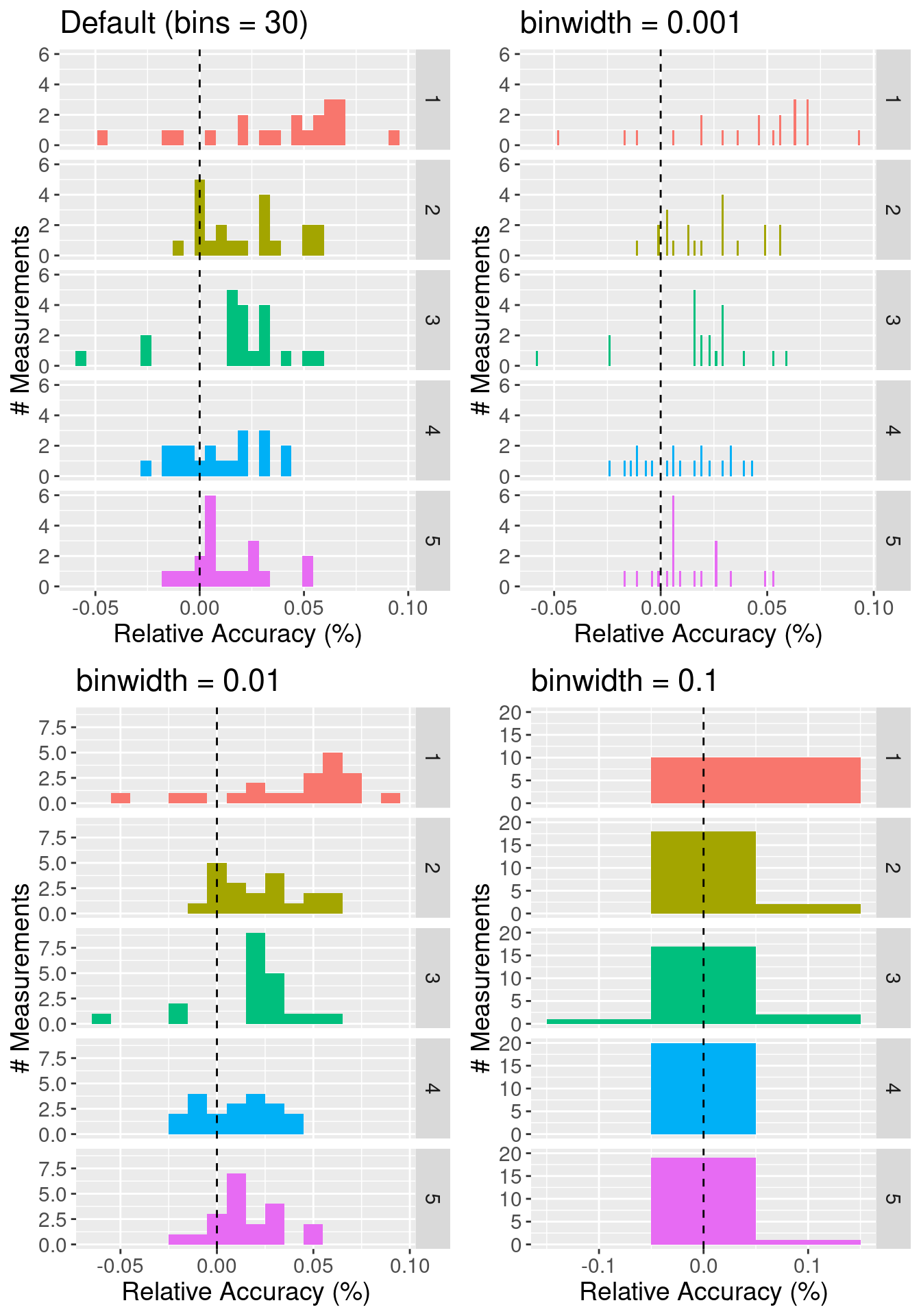
Figure 4.25: Effect of varying bin width on histograms.
Adding layers to a ggplot plot object
One of the powerful features of ggplot is that you
can continue to iterate on a single plot object, adding and refining
one layer at a time. If you stored your plot as a named object
using the assignment symbol (<-), you can
add to it using the + operator.
For example, if we wanted to add a title to the last plot we created (morley_hist),
we can use the + operator to add a title layer with the ggtitle function.
The result is shown in Figure 4.26.
morley_hist_title <- morley_hist +
  ggtitle("Speed of light experiments \n were accurate to about 0.05%")

morley_hist_title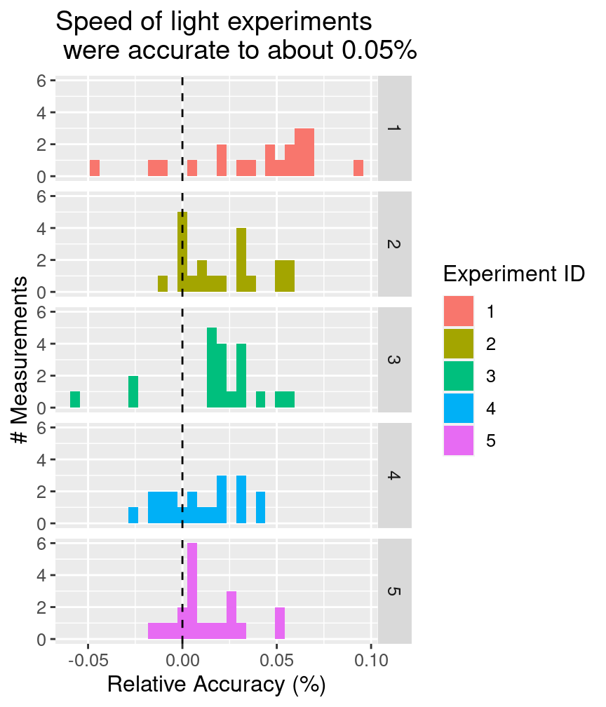
Figure 4.26: Histogram of relative accuracy split vertically by experiment with a descriptive title highlighting the take home message of the visualization.
Note: Good visualization titles clearly communicate the take home message to the audience. Typically, that is the answer to the question you posed before making the visualization.
4.6 Explaining the visualization
Tell a story
Typically, your visualization will not be shown entirely on its own, but rather it will be part of a larger presentation. Further, visualizations can provide supporting information for any aspect of a presentation, from opening to conclusion. For example, you could use an exploratory visualization in the opening of the presentation to motivate your choice of a more detailed data analysis / model, a visualization of the results of your analysis to show what your analysis has uncovered, or even one at the end of a presentation to help suggest directions for future work.
Regardless of where it appears, a good way to discuss your visualization is as a story:
- Establish the setting and scope, and describe why you did what you did.
- Pose the question that your visualization answers. Justify why the question is important to answer.
- Answer the question using your visualization. Make sure you describe all aspects of the visualization (including describing the axes). But you
can emphasize different aspects based on what is important to answer your question:
- trends (lines): Does a line describe the trend well? If so, the trend is linear, and if not, the trend is nonlinear. Is the trend increasing, decreasing, or neither? Is there a periodic oscillation (wiggle) in the trend? Is the trend noisy (does the line “jump around” a lot) or smooth?
- distributions (scatters, histograms): How spread out are the data? Where are they centered, roughly? Are there any obvious “clusters” or “subgroups”, which would be visible as multiple bumps in the histogram?
- distributions of two variables (scatters): Is there a clear / strong relationship between the variables (points fall in a distinct pattern), a weak one (points fall in a pattern but there is some noise), or no discernible relationship (the data are too noisy to make any conclusion)?
- amounts (bars): How large are the bars relative to one another? Are there patterns in different groups of bars?
- Summarize your findings, and use them to motivate whatever you will discuss next.
Below are two examples of how one might take these four steps in describing the example visualizations that appeared earlier in this chapter. Each of the steps is denoted by its numeral in parentheses, e.g. (3).
Mauna Loa Atmospheric CO2 Measurements: (1) Many current forms of energy generation and conversion—from automotive engines to natural gas power plants—rely on burning fossil fuels and produce greenhouse gases, typically primarily carbon dioxide (CO2), as a byproduct. Too much of these gases in the Earth’s atmosphere will cause it to trap more heat from the sun, leading to global warming. (2) In order to assess how quickly the atmospheric concentration of CO2 is increasing over time, we (3) used a data set from the Mauna Loa observatory in Hawaii, consisting of CO2 measurements from 1980 to 2020. We plotted the measured concentration of CO2 (on the vertical axis) over time (on the horizontal axis). From this plot, you can see a clear, increasing, and generally linear trend over time. There is also a periodic oscillation that occurs once per year and aligns with Hawaii’s seasons, with an amplitude that is small relative to the growth in the overall trend. This shows that atmospheric CO2 is clearly increasing over time, and (4) it is perhaps worth investigating more into the causes.
Michelson Light Speed Experiments: (1) Our modern understanding of the physics of light has advanced significantly from the late 1800s when Michelson and Morley’s experiments first demonstrated that it had a finite speed. We now know, based on modern experiments, that it moves at roughly 299,792.458 kilometers per second. (2) But how accurately were we first able to measure this fundamental physical constant, and did certain experiments produce more accurate results than others? (3) To better understand this, we plotted data from 5 experiments by Michelson in 1879, each with 20 trials, as histograms stacked on top of one another. The horizontal axis shows the accuracy of the measurements relative to the true speed of light as we know it today, expressed as a percentage. From this visualization, you can see that most results had relative errors of at most 0.05%. You can also see that experiments 1 and 3 had measurements that were the farthest from the true value, and experiment 5 tended to provide the most consistently accurate result. (4) It would be worth further investigating the differences between these experiments to see why they produced different results.
4.7 Saving the visualization
Choose the right output format for your needs
Just as there are many ways to store data sets, there are many ways to store visualizations and images. Which one you choose can depend on several factors, such as file size/type limitations (e.g., if you are submitting your visualization as part of a conference paper or to a poster printing shop) and where it will be displayed (e.g., online, in a paper, on a poster, on a billboard, in talk slides). Generally speaking, images come in two flavors: raster formats and vector formats.
Raster images are represented as a 2-D grid of square pixels, each with its own color. Raster images are often compressed before storing so they take up less space. A compressed format is lossy if the image cannot be perfectly re-created when loading and displaying, with the hope that the change is not noticeable. Lossless formats, on the other hand, allow a perfect display of the original image.
- Common file types:
- Open-source software: GIMP
Vector images are represented as a collection of mathematical objects (lines, surfaces, shapes, curves). When the computer displays the image, it redraws all of the elements using their mathematical formulas.
- Common file types:
- Open-source software: Inkscape
Raster and vector images have opposing advantages and disadvantages. A raster image of a fixed width / height takes the same amount of space and time to load regardless of what the image shows (the one caveat is that the compression algorithms may shrink the image more or run faster for certain images). A vector image takes space and time to load corresponding to how complex the image is, since the computer has to draw all the elements each time it is displayed. For example, if you have a scatter plot with 1 million points stored as an SVG file, it may take your computer some time to open the image. On the other hand, you can zoom into / scale up vector graphics as much as you like without the image looking bad, while raster images eventually start to look “pixelated.”
Note: The portable document format PDF (
Let’s learn how to save plot images to these different file formats using a scatter plot of the Old Faithful data set (Hardle 1991), shown in Figure 4.27.
library(svglite) # we need this to save SVG files
faithful_plot <- ggplot(data = faithful, aes(x = waiting, y = eruptions)) +
  geom_point() +
  labs(x = "Waiting time to next eruption \n (minutes)",
       y = "Eruption time \n (minutes)") +
  theme(text = element_text(size = 12))

faithful_plot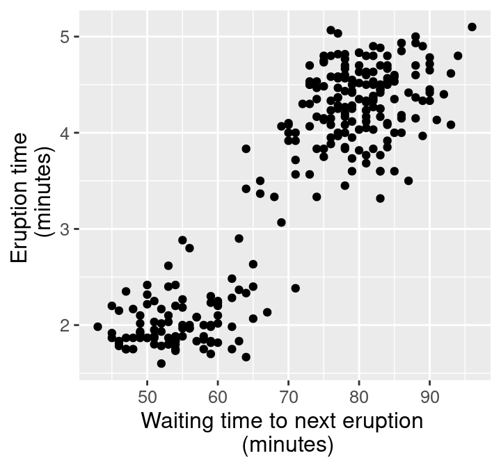
Figure 4.27: Scatter plot of waiting time and eruption time.
Now that we have a named ggplot plot object, we can use the ggsave function
to save a file containing this image.
ggsave works by taking a file name to create for the image
as its first argument.
This can include the path to the directory where you would like to save the file
(e.g., img/viz/filename.png to save a file named filename to the img/viz/ directory),
and the name of the plot object to save as its second argument.
The kind of image to save is specified by the file extension.
For example,
to create a PNG image file, we specify that the file extension is .png.
Below we demonstrate how to save PNG, JPG, BMP, TIFF and SVG file types
for the faithful_plot:
ggsave("img/viz/faithful_plot.png", faithful_plot)
ggsave("img/viz/faithful_plot.jpg", faithful_plot)
ggsave("img/viz/faithful_plot.bmp", faithful_plot)
ggsave("img/viz/faithful_plot.tiff", faithful_plot)
ggsave("img/viz/faithful_plot.svg", faithful_plot)| Image type | File type | Image size |
|---|---|---|
| Raster | PNG | 0.15 MB |
| Raster | JPG | 0.42 MB |
| Raster | BMP | 3.15 MB |
| Raster | TIFF | 9.44 MB |
| Vector | SVG | 0.03 MB |
Take a look at the file sizes in Table 4.1. Wow, that’s quite a difference! Notice that for such a simple plot with few graphical elements (points), the vector graphics format (SVG) is over 100 times smaller than the uncompressed raster images (BMP, TIFF). Also, note that the JPG format is twice as large as the PNG format since the JPG compression algorithm is designed for natural images (not plots).
In Figure 4.28, we also show what the images look like when we zoom in to a rectangle with only 2 data points. You can see why vector graphics formats are so useful: because they’re just based on mathematical formulas, vector graphics can be scaled up to arbitrary sizes. This makes them great for presentation media of all sizes, from papers to posters to billboards.
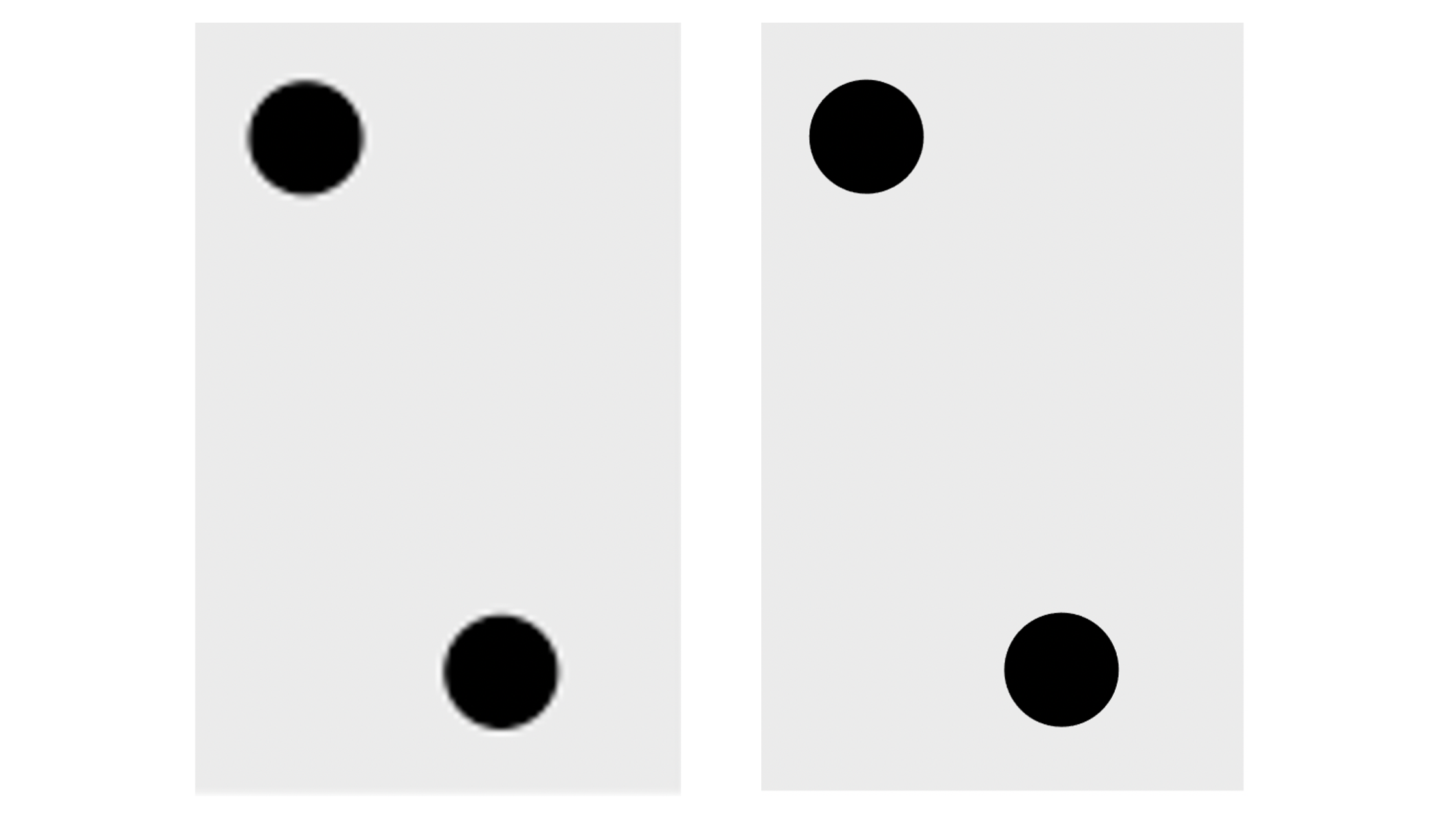
Figure 4.28: Zoomed in faithful, raster (PNG, left) and vector (SVG, right) formats.
4.8 Exercises
Practice exercises for the material covered in this chapter can be found in the accompanying worksheets repository in the “Effective data visualization” row. You can launch an interactive version of the worksheet in your browser by clicking the “launch binder” button. You can also preview a non-interactive version of the worksheet by clicking “view worksheet.” If you instead decide to download the worksheet and run it on your own machine, make sure to follow the instructions for computer setup found in Chapter 13. This will ensure that the automated feedback and guidance that the worksheets provide will function as intended.
4.9 Additional resources
- The
ggplot2R package page (Wickham, Chang, et al. 2021) is where you should look if you want to learn more about the functions in this chapter, the full set of arguments you can use, and other related functions. The site also provides a very nice cheat sheet that summarizes many of the data wrangling functions from this chapter. - The Fundamentals of Data Visualization (Wilke 2019) has a wealth of information on designing effective visualizations. It is not specific to any particular programming language or library. If you want to improve your visualization skills, this is the next place to look.
- R for Data Science (Wickham and Grolemund 2016) has a chapter on creating visualizations using
ggplot2. This reference is specific to R andggplot2, but provides a much more detailed introduction to the full set of tools thatggplot2provides. This chapter is where you should look if you want to learn how to make more intricate visualizations inggplot2than what is included in this chapter. - The
themefunction documentation is an excellent reference to see how you can fine tune the non-data aspects of your visualization. - R for Data Science (Wickham and Grolemund 2016) has a chapter on dates and
times. This chapter is where
you should look if you want to learn about
datevectors, including how to create them, and how to use them to effectively handle durations, periods and intervals using thelubridatepackage.