A Tour of Python Packages for Scientific Computing
Python Packages and Modules
A module is simply a file containing Python code which defines variables, functions and classes, and a package is a collection of modules.
Use the keyword import to import a module or packages into your Python environment. We access variables, functions, classes, etc. from a module or package using the dot notation.
See Mathematical Python for an introduction to Python, SciPy and Jupyter with mathematical applications.
NumPy, SciPy and Matplotlib
NumPy is the core numerical computing package in Python. It provides the ndarray object which represents vectors, matrices and arrays of any dimension. Every other package we talk about today is built on NumPy and ndarray.
SciPy is a library containing packages for numerical integration, linear algebra, signal processing, and much more.
Matplotlib is a plotting library.
Let’s begin by importing NumPy under the alias np and matplotlib.pyplot as plt.
import numpy as np
import matplotlib.pyplot as plt
Basic Plotting
The procedure is simple:
Create a NumPy array of \(x\) values
Use NumPy functions to create an array of \(y\) values
Plot with the command
plt.plot(x,y)
See more matplotlib.pyplot commands.
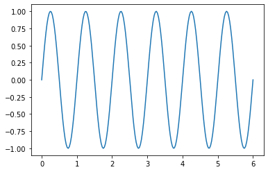
Plot \(y = \sin(2 \pi x)\) over the interval \([0,6]\).
x = np.linspace(0,6,200)
y = np.sin(2*np.pi*x)
plt.plot(x,y)
plt.show()
Plot the parametric curve given by \(x = 2 k \cos(t) - a \cos(k t)\), \(y = 2 k \sin(t) - a \sin(k t)\) over the interval \(t \in [0,2 \pi]\) for different values \(a\) and \(k\).
k = 6; a = 11;
t = np.linspace(0,2*np.pi,1000)
x = 2*k*np.cos(t) - a*np.cos(k*t)
y = 2*k*np.sin(t) - a*np.sin(k*t)
plt.plot(x,y)
plt.axis('equal')
plt.axis('off')
plt.show()

Numerical Integration
The function scipy.integrate.quad module computes approximations of definite integrals.
import scipy.integrate as spi
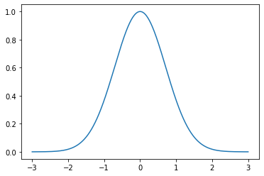
Plot the Gaussian \(e^{-x^2}\) over the interval \([-3,3]\) and verify the formula
x = np.linspace(-3,3,1000)
y = np.exp(-x**2)
plt.plot(x,y)
plt.show()
Compute the integral and estimate error
I, err = spi.quad(lambda x: np.exp(-x**2),-np.inf,np.inf)
print(I)
1.7724538509055159
Compare to \(\sqrt{\pi}\)
np.pi**0.5
1.7724538509055159
Logistic Equation
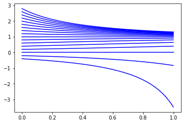
The function scipy.integrate.odeint computes approximations of solutions of differential equations. Plot numerical solutions of the logistic equation \(y' = y(1-y)\) for different initial conditions \(y(0)\).
def odefun(y,t):
    return y*(1-y)

t = np.linspace(0,1,100)

for y0 in np.arange(-0.4,3,0.2):
    y = spi.odeint(odefun,y0,t)
    plt.plot(t,y,'b')
Euler’s 3-body Problem
Write a function called euler3body which takes input parameters:
m1is the mass of star 1x1is the position vector of star 1m2is the mass of star 2x2is the position vector of star 2u0is the initial values vector of the planet \([x(0),x'(0),y(0),y'(0)]\)tfis the final time valueNis the number of t values per year (default valueN=100)
and plots the approximations \(x(t)\) versus \(y(t)\).
def euler3body(m1,x1,m2,x2,u0,tf,N=100):

    def odefun(u,t):
        G = 4*np.pi**2
        d1 = np.sqrt((u[0] - x1[0])**2 + (u[2] - x1[1])**2)
        d2 = np.sqrt((u[0] - x2[0])**2 + (u[2] - x2[1])**2)
        dudt = np.zeros(4)
        dudt[0] = u[1]
        dudt[1] = -G*(m1*(u[0] - x1[0])/d1**3 + m2*(u[0] - x2[0])/d2**3)
        dudt[2] = u[3]
        dudt[3] = -G*(m1*(u[2] - x1[1])/d1**3 + m2*(u[2] - x2[1])/d2**3)
        return dudt

    t = np.linspace(0,tf,100*tf)
    U = spi.odeint(odefun,u0,t)
    plt.plot(U[:,0],U[:,2])
    plt.plot(x1[0],x1[1],'r.',MarkerSize=m1*10)
    plt.plot(x2[0],x2[1],'r.',MarkerSize=m2*10)
    plt.axis('equal')
    plt.show()
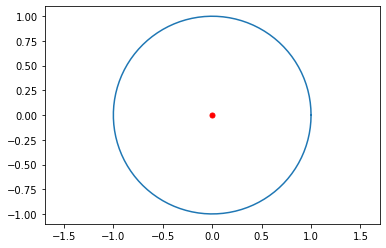
Test the function with input where we know the output. We can model the orbit of the Earth around the Sun by setting \(m_1=1\) and \(m_2=0\) with Star 1 at the origin, and \(\mathbf{u}_0=[1,0,0,2\pi]\) to start the planet at 1AU from the Sun and velocity \(2\pi\) AU/year to produce a near circular orbit.
euler3body(1,[0,0],0,[0,0],[1,0,0,2*np.pi],1)
Success! Let’s try to create some cool orbits!
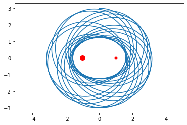
euler3body(2,[-1,0],1,[1,0],[0,5,3,0],30,200)
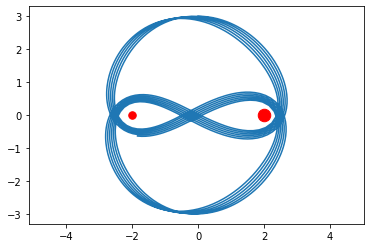
euler3body(1.5,[-2,0],2.5,[2,0],[0,4.8,3,0],20)
euler3body(2,[-1,1],1,[1,-1],[0,10,0,5],30)
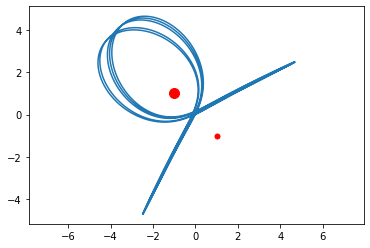
Image Deblurring
The subpackage scipy.linalg contains many functions and algorithms for numerical linear algebra.
import scipy.linalg as la
Blurring images by Toeplitz matrices
Represent a image as a matrix \(X\). Use the function scipy.linalg.toeplitz to create a Toeplitz matrices \(A_c\) and \(A_r\). Matrix multiplication on the left \(A_c X\) blurs vertically (in the columns) and on the right \(X A_r\) blurs horizontally (in the rows).
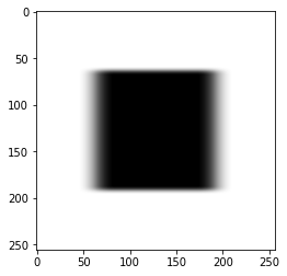
Start with a simple example. Create an \(256 \times 256\) matrix of zeros and ones which represents the image of square.
N = 256

Z = np.zeros((N//4,N//4))
O = np.ones((N//4,N//4))
X = np.block([[Z,Z,Z,Z],[Z,O,O,Z],[Z,O,O,Z],[Z,Z,Z,Z]])
plt.imshow(X,cmap='binary')
plt.show()

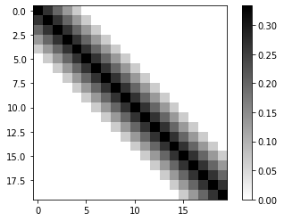
Create a Toeplitz matrix where the values decrease from the diagonal.
c = np.zeros(N)
s = 5
c[:s] = (s - np.arange(0,s))/(3*s)
Ac = la.toeplitz(c)

Ac[:5,:5]
array([[0.33333333, 0.26666667, 0.2       , 0.13333333, 0.06666667],
       [0.26666667, 0.33333333, 0.26666667, 0.2       , 0.13333333],
       [0.2       , 0.26666667, 0.33333333, 0.26666667, 0.2       ],
       [0.13333333, 0.2       , 0.26666667, 0.33333333, 0.26666667],
       [0.06666667, 0.13333333, 0.2       , 0.26666667, 0.33333333]])
plt.imshow(Ac[:20,:20],cmap='binary')
plt.colorbar()
plt.show()
Check the condition number of \(A_c\).
np.linalg.cond(Ac)
24782.3310425676
Blur the image \(X\) vertically.
plt.imshow(Ac @ X,cmap='binary')
plt.show()

Do the same but in the horizontal direction.
r = np.zeros(N)
s = 20
r[:s] = (s - np.arange(0,s))/(3*s)
Ar = la.toeplitz(r)

plt.imshow(X @ Ar.T,cmap='binary')
plt.show()

Combine both vertical and horizontal blurring.
plt.imshow(Ac @ X @ Ar.T,cmap='binary')
plt.show()
Inverting the noise
Let \(E\) represent some noise in the recording of the blurred image
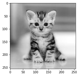
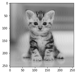
How do we find \(X\)? Let’s do an example with a real picture.
kitten = plt.imread('data/kitten.jpg').astype(np.float64)

kitten[:3,:3]
array([[150., 153., 158.],
       [150., 153., 158.],
       [149., 153., 157.]])
kitten.shape
(256, 256)
plt.imshow(kitten,cmap='gray')
plt.show()
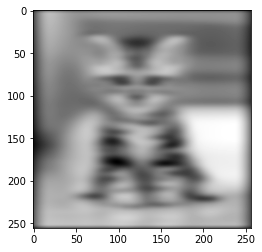
Add noise to the image.
noise = 0.01*np.random.randn(256,256)
B_E = Ac @ kitten @ Ar.T + noise

plt.imshow(B_E,cmap='gray')
plt.show()
Compute the solution directly
X1 = la.solve(Ac,B_E)
X2 = la.solve(Ar,X1.T)
X2 = X2.T

plt.imshow(X2,cmap='gray')
plt.show()
What happened? We computed
and the result is dominated by the inverted noise \(A_c^{-1} E ( A_r^T )^{-1}\).
Truncated SVD
We need to avoid inverting the noise therefore we compute using the truncated pseudoinverse
Pc,Sc,QTc = la.svd(Ac)
Pr,Sr,QTr = la.svd(Ar)

plt.figure(figsize=(12,4))
plt.subplot(1,2,1)
plt.plot(Sc)
plt.grid(True)
plt.title('Singular Values of $A_c$')

plt.subplot(1,2,2)
plt.plot(Sr)
plt.grid(True)
plt.title('Singular Values of $A_r$')
plt.show()
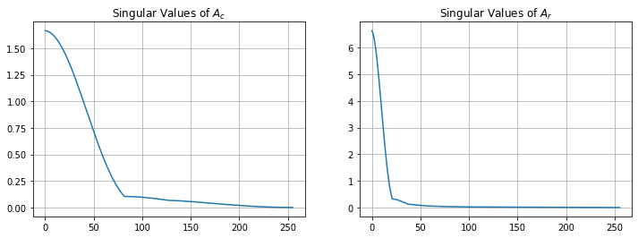
Compute the truncated pseudoinverse by cutting off small singular values.
k = 200
Ac_k_plus = QTc[:k,:].T @ np.diag(1/Sc[:k]) @ Pc[:,:k].T
Ar_k_plus = QTr[:k,:].T @ np.diag(1/Sr[:k]) @ Pr[:,:k].T
X = Ac_k_plus @ B_E @ Ar_k_plus
plt.imshow(X,cmap='gray')
plt.show()
We rescued the kitten!
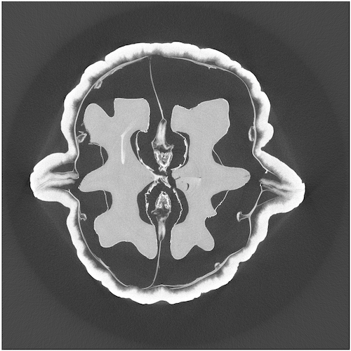
Computed Tomography
The following example is a tomographic X-ray data of a walnut. The dataset was prepared by the Finnish Inverse Problems Society. Import the MATLAB data file with scipy.io.loadmat.
from scipy.io import loadmat
data = loadmat('./data/ct.mat')
The data file contains a measurement matrix \(A\) and the projections vector \(m\). These are large matrices and so we need sparse matrices.
Measurement Matrix \(A\)
A = data['A']
A.data.nbytes
7762752
A.shape
(9840, 6724)
type(A)
scipy.sparse.csc.csc_matrix
Each row of the measurement matrix represents a projection of an X-ray through the sample as a particular angle. WE can visualize each row by reshaping into a matrix.
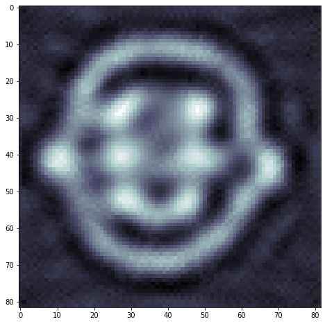
index = 300 #np.random.randint(0,A.shape[0])
proj = A[index,:].reshape(82,82)
plt.spy(proj)
plt.show()
print('Row: ',index)
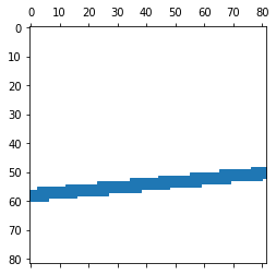
Row: 300
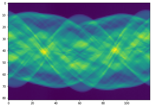
Sinogram: Measured Projections
The vector \(m\) is the collection of 82 projections from 120 different angles.
sinogram = data['m']
sinogram.nbytes
78720
sinogram.shape
(82, 120)
type(sinogram)
numpy.ndarray
plt.figure(figsize=(10,6))
plt.imshow(sinogram)
plt.show()
Compute Truncated SVD Solution
We need to solve \(A\mathbf{x} = \mathbf{b}\) (where \(\mathbf{b}\) is the vector of projections) however there are errors in the projections vector \(\mathbf{b}\) and so we actually have
where \(\mathbf{e}\) is noise. We need to compute the truncated pseudoinverse to avoid inverting the noise
b = sinogram.reshape([82*120,1],order='F')
We proceed as in the last example but now we need functions for sparse matrices using scipy.sparse.
from scipy.sparse import linalg as sla
Truncate the measurement matrix after the largest \(k\) singular values and compute the pseudoinverse.
k = 200
P,S,QT = sla.svds(A,k=k)
P.shape
(9840, 200)
QT.shape
(200, 6724)
A_k_plus = QT.T @ np.diag(1/S) @ P.T
X = A_k_plus @ b
plt.figure(figsize=(8,8))
plt.imshow(X.reshape(82,82).T,cmap='bone')
plt.show()
pandas
pandas is the main Python package for data analysis. Load tabular data with the all important pandas.read_csv function. Let’s do an example with Vancouver weather data taken from Vancouver Weather Statistics.
import pandas as pd
data = pd.read_csv('./data/weatherstats_vancouver_hourly.csv',
                   parse_dates=['date_time_local'],
                   usecols=[0,2,4,5,6,8,10])
/opt/hostedtoolcache/Python/3.7.9/x64/lib/python3.7/site-packages/dateutil/parser/_parser.py:1218: UnknownTimezoneWarning: tzname PDT identified but not understood.  Pass `tzinfos` argument in order to correctly return a timezone-aware datetime.  In a future version, this will raise an exception.
  category=UnknownTimezoneWarning)
/opt/hostedtoolcache/Python/3.7.9/x64/lib/python3.7/site-packages/dateutil/parser/_parser.py:1218: UnknownTimezoneWarning: tzname PST identified but not understood.  Pass `tzinfos` argument in order to correctly return a timezone-aware datetime.  In a future version, this will raise an exception.
  category=UnknownTimezoneWarning)
data.head()
| date_time_local | pressure_station | wind_dir | wind_dir_10s | wind_speed | relative_humidity | temperature | |
|---|---|---|---|---|---|---|---|
| 0 | 2020-08-12 08:00:00 | NaN | NaN | NaN | NaN | NaN | NaN |
| 1 | 2020-08-12 07:00:00 | 101.48 | W | 27.0 | 17.0 | 77.0 | 14.3 |
| 2 | 2020-08-12 06:00:00 | 101.40 | W | 27.0 | 18.0 | 78.0 | 13.6 |
| 3 | 2020-08-12 05:00:00 | 101.35 | W | 27.0 | 21.0 | 73.0 | 14.2 |
| 4 | 2020-08-12 04:00:00 | 101.30 | W | 28.0 | 26.0 | 71.0 | 14.5 |
data.info()
<class 'pandas.core.frame.DataFrame'>
RangeIndex: 15000 entries, 0 to 14999
Data columns (total 7 columns):
 #   Column             Non-Null Count  Dtype
---  ------             --------------  -----
 0   date_time_local    15000 non-null  datetime64[ns]
 1   pressure_station   14999 non-null  float64
 2   wind_dir           14823 non-null  object
 3   wind_dir_10s       14998 non-null  float64
 4   wind_speed         14999 non-null  float64
 5   relative_humidity  14998 non-null  float64
 6   temperature        14998 non-null  float64
dtypes: datetime64[ns](1), float64(5), object(1)
memory usage: 820.4+ KB
Use the datetime functionality to convert the datetime column into columns with year, month, day and hour.
data['year'] = data['date_time_local'].dt.year
data['month'] = data['date_time_local'].dt.month
data['day'] = data['date_time_local'].dt.day
data['hour'] = data['date_time_local'].dt.hour
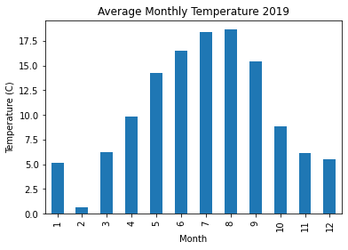
Plot the average monthly temparature in 2019.
data2019 = data[data['year'] == 2019]
data2019.groupby('month')['temperature'].mean().plot(kind='bar')
plt.title('Average Monthly Temperature 2019')
plt.xlabel('Month'), plt.ylabel('Temperature (C)')
plt.show()
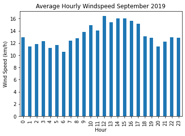
Plot the average hourly wind speed in September 2019.
data2019[data2019['month'] == 9].groupby('hour')['wind_speed'].mean().plot(kind='bar')
plt.title('Average Hourly Windspeed September 2019')
plt.xlabel('Hour'), plt.ylabel('Wind Speed (km/h)')
plt.show()
scikit-learn
scikit-learn provides simple implementations of many machine learning algorithms.
Hand-written digits dataset
scikit-learn comes with builtin datasets for experimentation. Let’s import the digits dataset and use the data to create a model which will predict the correct digit for a new image sample.
from sklearn.datasets import load_digits
digits = load_digits()
digits.keys()
dict_keys(['data', 'target', 'frame', 'feature_names', 'target_names', 'images', 'DESCR'])
images = digits.images
images.shape
(1797, 8, 8)
plt.imshow(images[1001,:,:],cmap='binary',interpolation='gaussian')
plt.show()
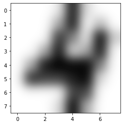
The images array is a 3D array where, for each index i, the 2D array images[i,:,:] is a numeric array which represents an 8 by 8 pixel image of a hand-written digit.
images[1001,:,:]
array([[ 0.,  0.,  0.,  1., 15.,  2.,  0.,  0.],
       [ 0.,  0.,  0.,  5., 15.,  0.,  4.,  0.],
       [ 0.,  0.,  0., 13.,  8.,  1., 16.,  3.],
       [ 0.,  0.,  5., 15.,  2.,  5., 15.,  0.],
       [ 0.,  5., 15., 16., 16., 16.,  8.,  0.],
       [ 0., 14., 12., 12., 14., 16.,  2.,  0.],
       [ 0.,  0.,  0.,  0., 12., 12.,  0.,  0.],
       [ 0.,  0.,  0.,  2., 16.,  5.,  0.,  0.]])
K-nearest neighbors classifier
The K-nearest neighbors classifier is simple to understand: given our set of known digits as points in 64-dimensional space, look at a new sample as a new points in 64D and look at the labels of the K-nearest points in our training set to predict the correct label.
from sklearn.neighbors import KNeighborsClassifier as KNN
from sklearn.model_selection import train_test_split
clf = KNN(n_neighbors = 10)
X_train, X_test, y_train, y_test = train_test_split(digits.data,digits.target,test_size=0.3)
clf.fit(X_train,y_train)
KNeighborsClassifier(n_neighbors=10)
clf.score(X_test,y_test)
0.9814814814814815
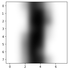
plt.imshow(X_test[10,:].reshape(8,8),cmap='binary',interpolation='gaussian')
plt.show()
clf.predict(X_test[10,:].reshape(1,64))
array([1])
Easy as that! We have a model which is around 97% accurate on our testing data!
Principal Component Analysis
Each sample in the digits dataset is an 8 by 8 pixel image of a handwritten digit. We represent each image as a vector in 64-dimensional space. Let’s use principal component analysis to project that 64-dimensional space of digits down to 2D while preserving as much of the variance in the data as possible.
Instantiate a PCA object
Principal component analysis projects the data onto orthogonal components in the feature space so that each component captures the maximum amount of variance. We’ll apply PCA to the digits dataset and observe the results and then we’ll do the computation for ourselves to see what’s going on under the hood.
from sklearn.decomposition import PCA
pca = PCA(n_components=2) # We want 2 principal components so that we can plot the dataset in 2D
Compute the principal components
pca.fit(digits.data)
PCA(n_components=2)
The model has computed the 2 principal components. What are they? They are vectors in the feature space. In other words, they are 8 by 8 pixel images. What do they look like? We can access the components using the .components_ attribute.
pca.components_.shape
(2, 64)
p1 = pca.components_[0,:] # First principal component
p2 = pca.components_[1,:] # Second principal component
plt.figure(figsize=(15,5))
plt.subplot(1,2,1)
plt.imshow(p1.reshape(8,8),cmap='binary'), plt.title('First Principal Component')
plt.subplot(1,2,2)
plt.imshow(p2.reshape(8,8),cmap='binary'), plt.title('Second Principal Component')
plt.show()
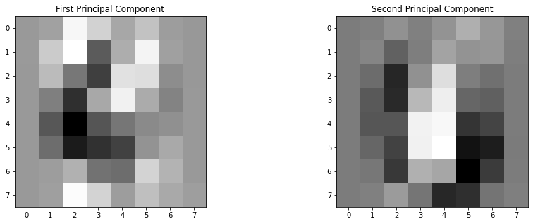
This means that our PCA object is now equipped to project each image onto these two principal components. Looking at the 2 principal components, we can see that the best 2D representation of the dataset is the result of how much a digits looks like a 3 and how much it looks like a 0.
Visualizing the digits dataset
Now we can apply the .transform method to whole dataset and plot the result.
digits_2D = pca.transform(digits.data)

plt.figure(figsize=(18,8))

plt.scatter(digits_2D[:,0],digits_2D[:,1],c=digits.target,s=100,alpha=0.5,lw=0,cmap=plt.cm.get_cmap('jet', 10));
plt.colorbar(ticks=range(0,10)); plt.clim([-0.5,9.5]);
plt.show()
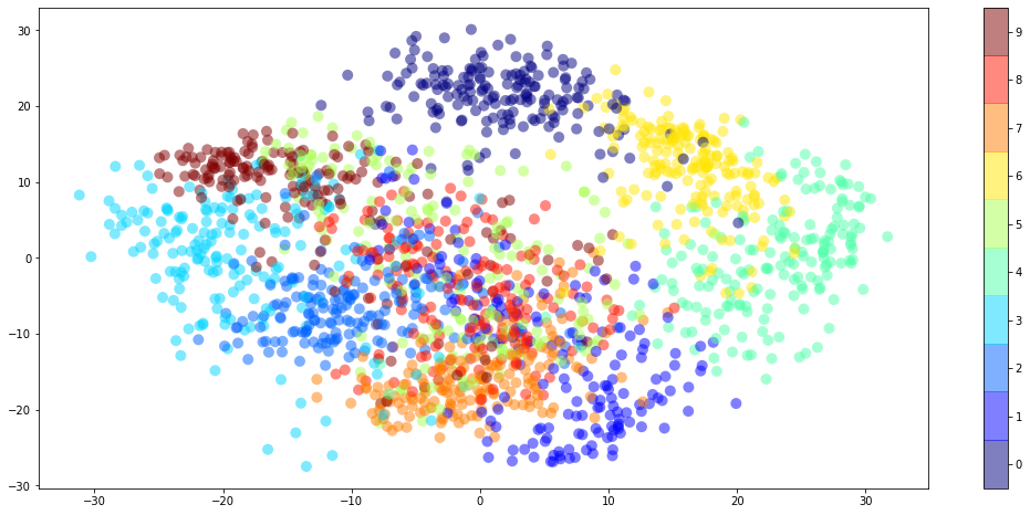
Notice how all the 3s are to the left along the horizontal axis. This is because the first principal component is a 3 except with the colors inverted. Similarly, the 0s are at the bottom along the vertical axis because the second principal component is a 0 again with the colors inverted.
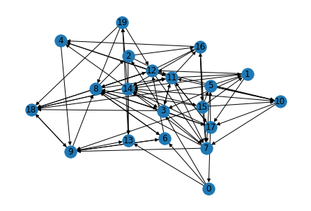
NetworkX
NetworkX is a Python package for network analysis. Let’s create a random directed graph and compute the PageRank of each node.
import networkx as nx
n_pages = 20
n_links = 100
edges = [(np.random.randint(n_pages),np.random.randint(n_pages)) for _ in range(0,n_links)]
G = nx.DiGraph(edges)
nx.draw(G,pos=nx.spring_layout(G),with_labels=True)
ranks = nx.pagerank(G)
nx.draw(G,node_color=list(ranks.values()),cmap='winter',with_labels=True)
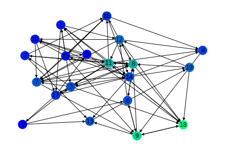
ranks
{15: 0.02258797829683527,
 5: 0.01626682002127012,
 17: 0.035435882015889604,
 14: 0.04462296899294341,
 11: 0.08729250687828811,
 18: 0.12191048411632714,
 9: 0.10596713008981737,
 0: 0.013524048602123665,
 6: 0.04644446989308877,
 12: 0.06107989825014321,
 7: 0.050463620910014474,
 2: 0.02813135395343686,
 19: 0.05707906269087664,
 10: 0.024324538491661322,
 8: 0.08890507274924601,
 16: 0.03530366616292815,
 1: 0.02429965225761032,
 3: 0.04727598165748564,
 13: 0.04940686793486309,
 4: 0.03967799603515077}